Packaging identity · Brand experience · Award winner · 2024

CacauParque

A chocolate bar becomes a ticket to an entire world.

An academic packaging system that connects LaCreme’s premium character with the anticipation, color and discovery of an amusement park.
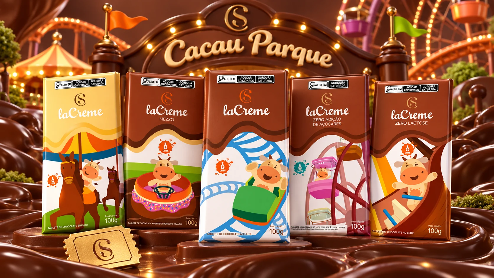
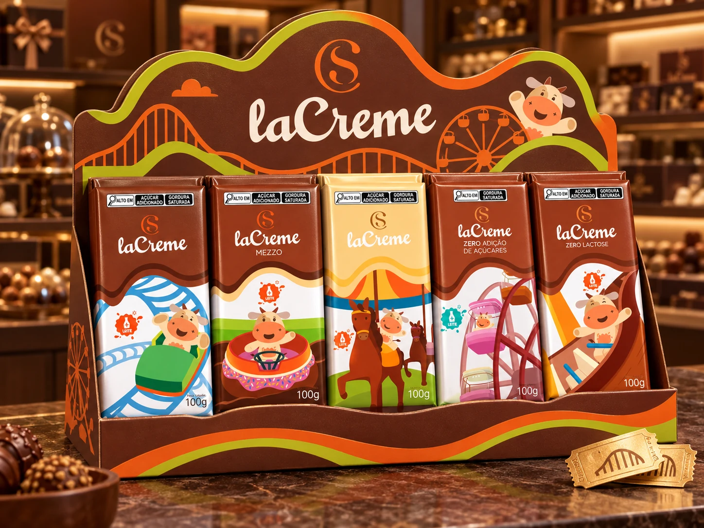
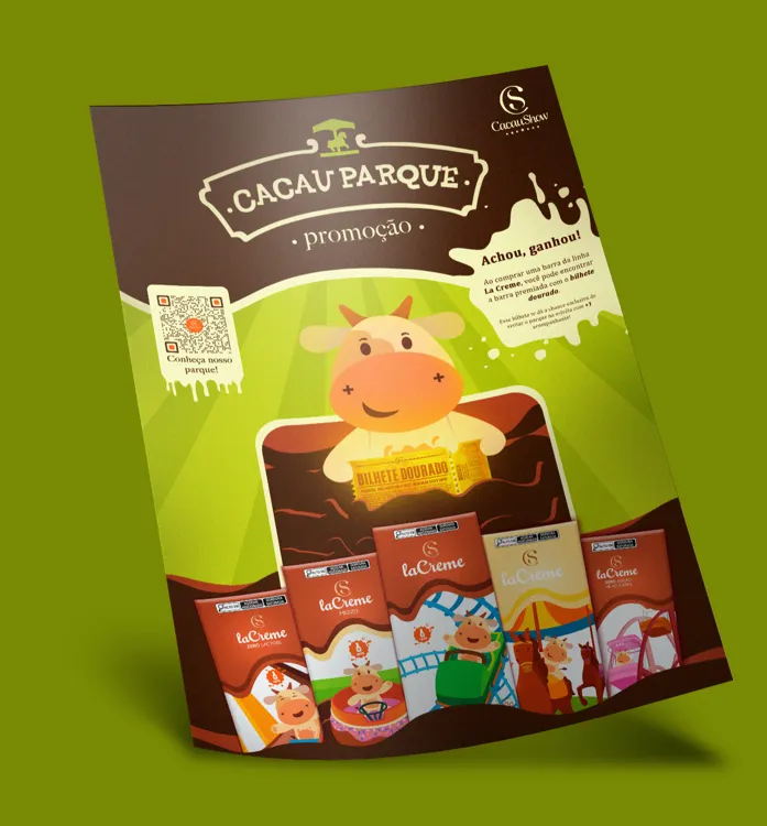
Five Cacau Parque LaCreme packages staged in a chocolate amusement park
Portfolio visualization · Complete packaging family
01 · Overview

Premium chocolate, recast as an experience.

Build a packaging family that feels at home on a chocolate shelf and inside a theme-park story.

The project responds to Cacau Show’s move into themed entertainment by imagining a launch that begins before the visitor reaches the park. Each LaCreme bar acts as a compact piece of that world.

Chocolate drips preserve the parent brand’s appetite appeal, while illustrated rides, friendly characters and a promotional ticket introduce surprise and collectability.

Context
Academic project · Anhembi Morumbi University
Role
Art direction, packaging and illustration
Disciplines
Branding · Packaging · Promotion
Outcome
1st place · Anhembi Awards
02 · Strategy

Make every flavor feel like a destination.

“The pack is not just a wrapper. It is the first ride.”
01

Recognition

Retain LaCreme’s familiar chocolate field, script logo and premium cues so the family remains immediately recognizable.

02

Discovery

Assign each pack its own attraction, character moment and color accent to encourage comparison and collecting.

03

Reward

Turn the golden ticket into a physical bridge between product, promotion and the imagined park experience.
Cacau Show parent-brand mark
Parent brand · Premium recognition
Cacau Parque identity mark
Project mark · The park gate becomes a signature
03 · Visual system

Chocolate anchors the system. Color brings the rides to life.

The palette moves from edible, premium browns into bright amusement-park accents. Cream keeps information legible across every pack size.

Cocoa#954A00
Orange#EB5713
Park lime#CAD225
Ride blue#3994CC
Candy pink#FF8DDF
Garden green#A3BC32
Ticket gold#FAB82A
Vanilla#FEF9BF
Dark chocolate#3A240D
Type architecture

Friendly headlines. Disciplined information.

Rounded display type carries the park personality; condensed supporting text protects clarity on small and large packaging formats.

Display / DemiBoldNeverMind Rounded

Park names, attraction titles and major calls to action.

Supporting / RegularNeverMind Rounded

Subheads and short descriptive messages.

Technical / Narrow + BoldArial Narrow

Ingredients, nutrition, legal copy and compact pack information from 4–14 pt.

04 · Packaging

Five packs. Five entrances to the park.

The family keeps a stable upper brand zone while the lower half becomes an illustrated stage. Every variant has its own ride, movement and color rhythm.
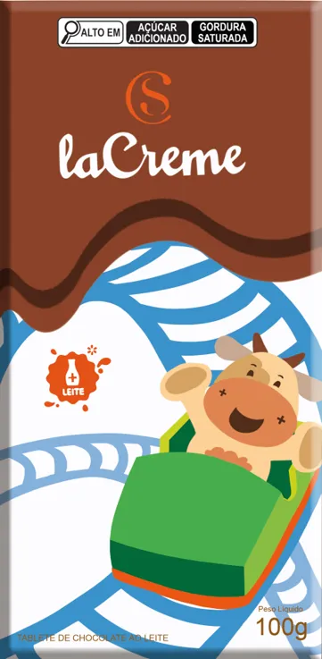
Cacau Parque LaCreme package featuring a blue roller coaster
Pack 01 · Roller coaster
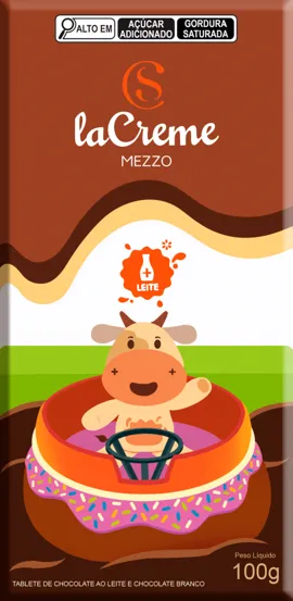
Cacau Parque LaCreme Mezzo package featuring a spinning ride
Pack 02 · Spinning ride
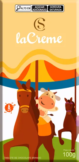
Cacau Parque white chocolate package featuring a carousel
Pack 03 · Carousel
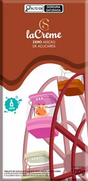
Cacau Parque zero sugar package featuring a ferris wheel
Pack 04 · Ferris wheel
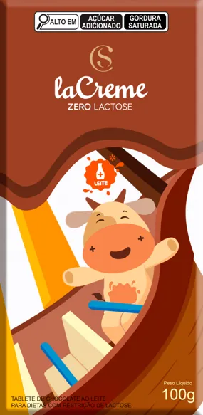
Cacau Parque zero lactose package featuring a thrill ride
Pack 05 · Thrill ride
Five Cacau Parque chocolate packages inside a premium retail display
Portfolio visualization · Point-of-sale family display
Original Cacau Parque promotional display with the complete chocolate collection
Original application · Promotional display
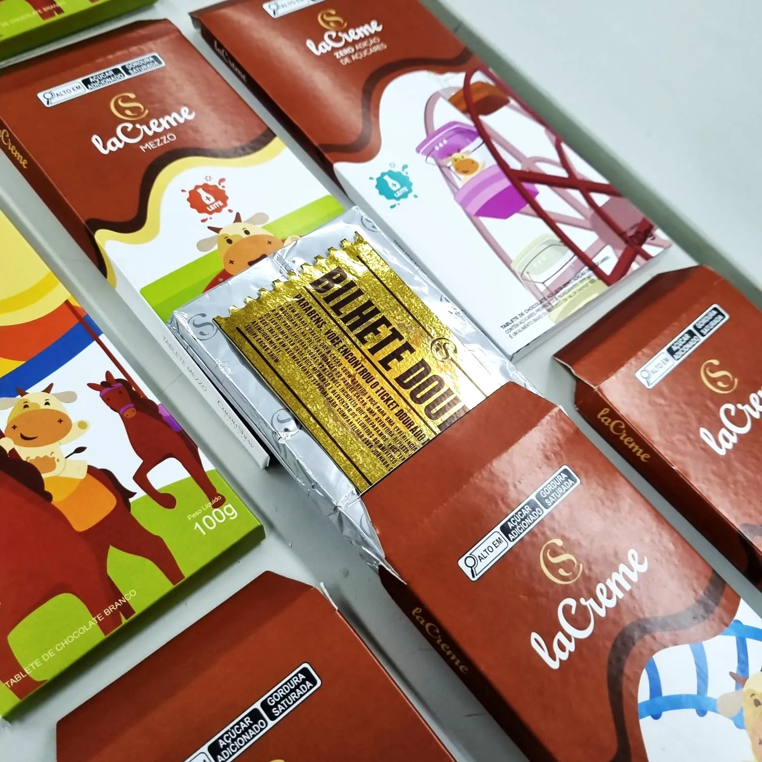
Printed Cacau Parque packages with a golden ticket revealed inside
Physical prototype · Packaging and reward
05 · Golden ticket

A reveal designed to turn purchase into anticipation.

Metallic gold interrupts the familiar chocolate experience with one unmistakable message: something rare has been found.
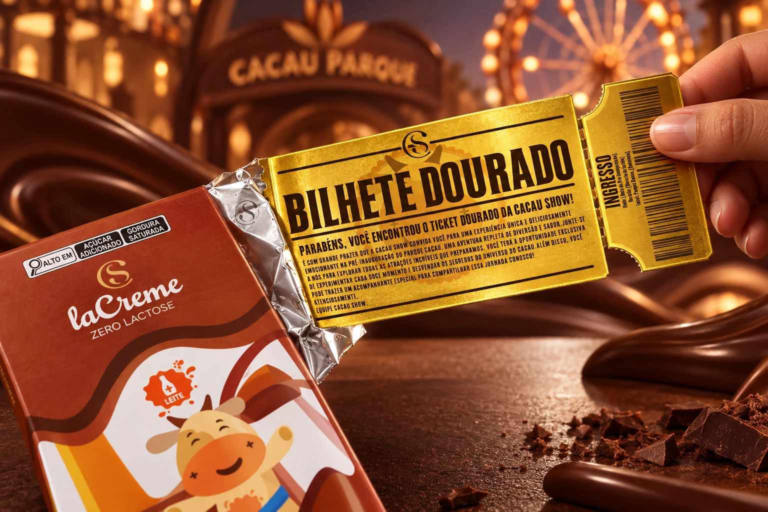
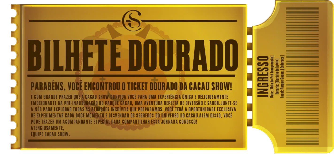
Golden Cacau Parque admission ticket being revealed from a LaCreme package
Portfolio visualization · The reveal moment
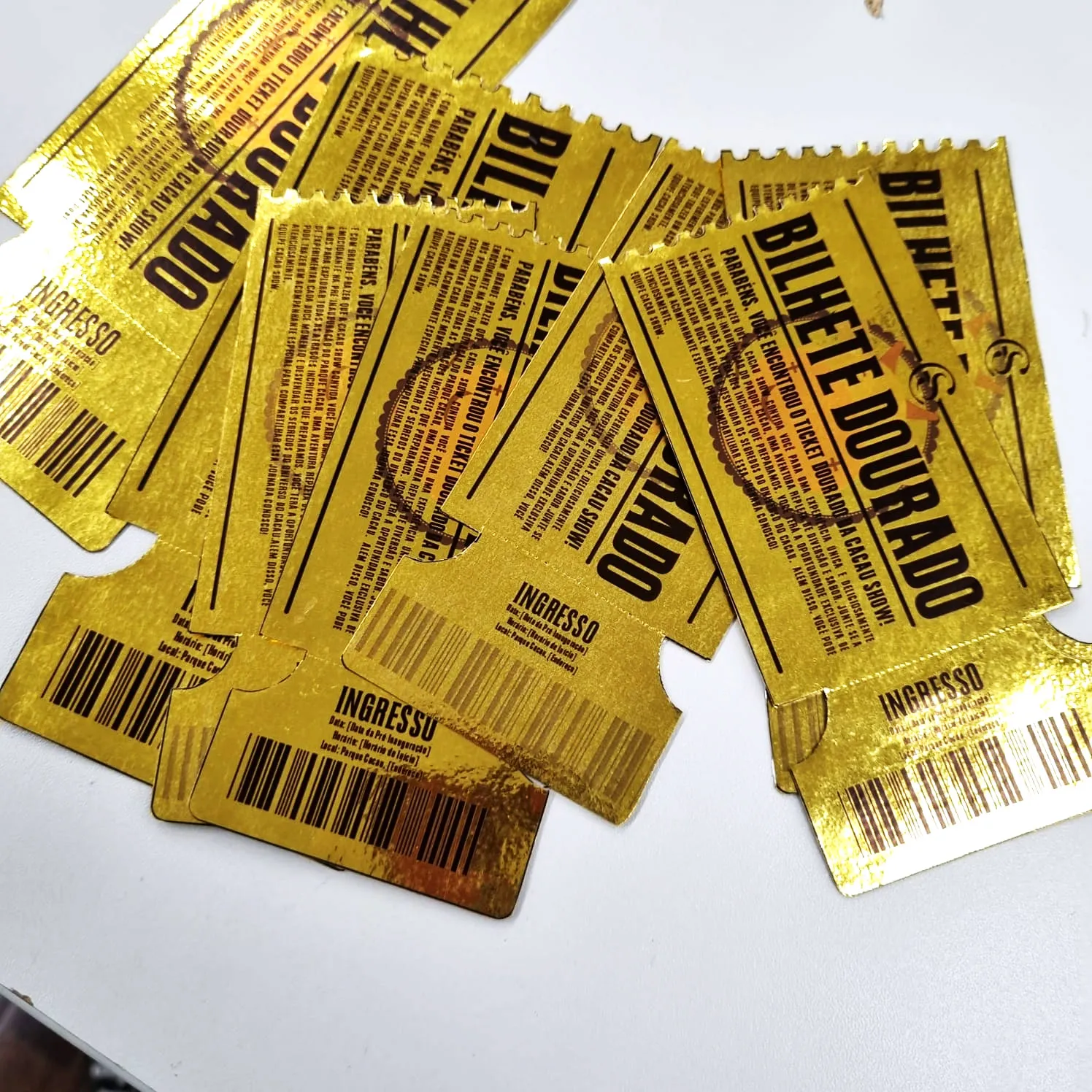
Cacau Parque golden ticket design
Ticket artwork · Metallic promotional insert
Printed Cacau Parque golden ticket prototypes
Physical production · Foil and print tests
06 · Park world

The illustrations connect every pack to a larger place.

The map expands the identity beyond packaging. Attractions become a reusable illustration library for wayfinding, campaigns and future touchpoints.
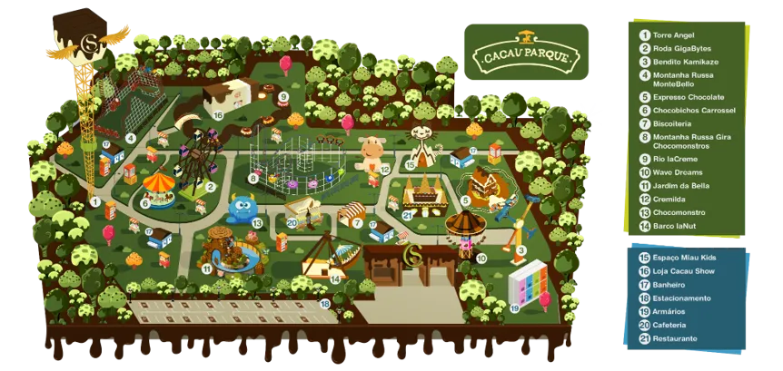

Illustrated map of the Cacau Parque attraction universe
Illustrated master map · 21 destinations and amenities
Bendito Kamikaze attraction illustration
Bendito Kamikaze
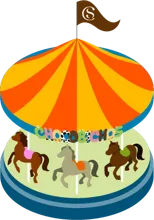
Chocobichos Carousel attraction illustration
Chocobichos Carousel
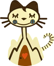
Miau Kids attraction illustration
Miau Kids
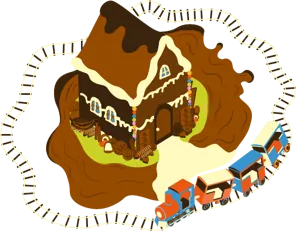
Chocolate Express attraction illustration
Chocolate Express
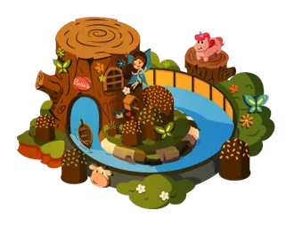
Bella Garden attraction illustration
Bella Garden
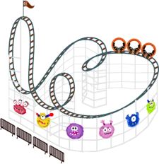
Gira Chocomonstros roller coaster illustration
Gira Chocomonstros
MonteBello roller coaster illustration
MonteBello
GigaBytes ferris wheel illustration
GigaBytes Wheel

Project film · Packaging, illustration and physical prototypes
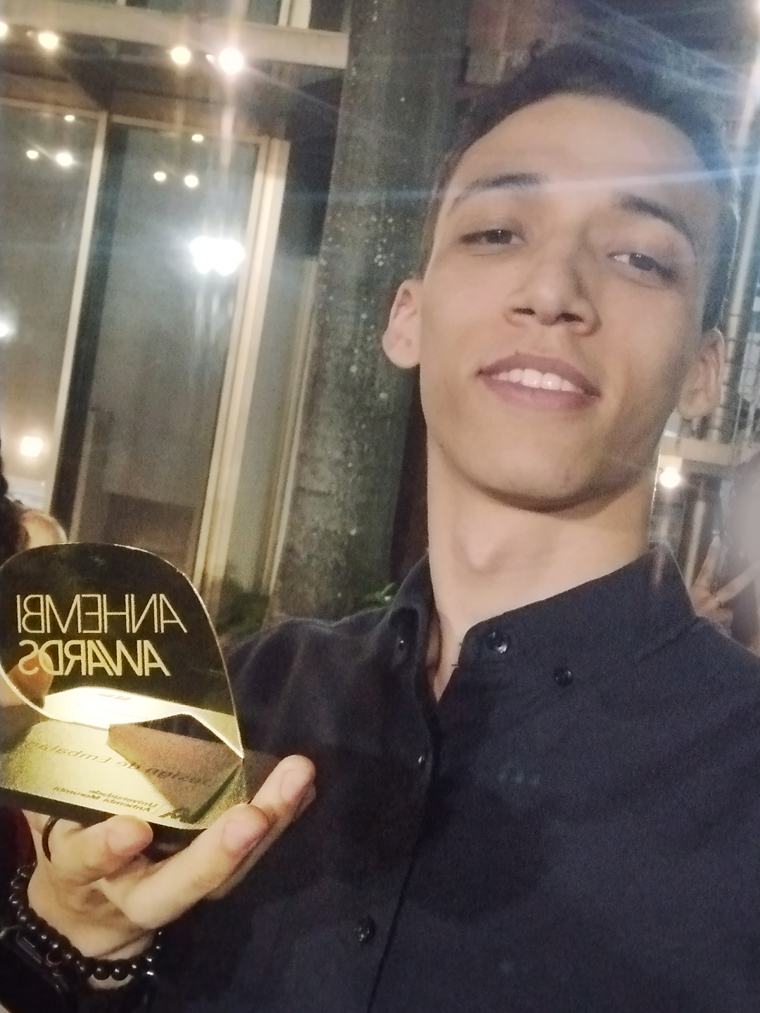
Higor Selvino holding the Anhembi Awards trophy
07 · Recognition

1st

Packaging Design at the first Anhembi Awards.

The project was recognized for connecting strategy, illustration and physical packaging in one coherent experience. The award turned an academic brief into a milestone in the portfolio.

What the project demonstrates

  • Building a sub-brand without losing parent-brand recognition
  • Designing a scalable system across multiple product variants
  • Connecting packaging to promotion and spatial storytelling
  • Taking a concept from research to physical prototypes
Next projectSongbird