Academic rebrand · Packaging · 2024

Baly Energy Drink

More than energy, attitude.

A visual repositioning built to keep Baly recognizable while giving five flavors one bold, coherent shelf presence.
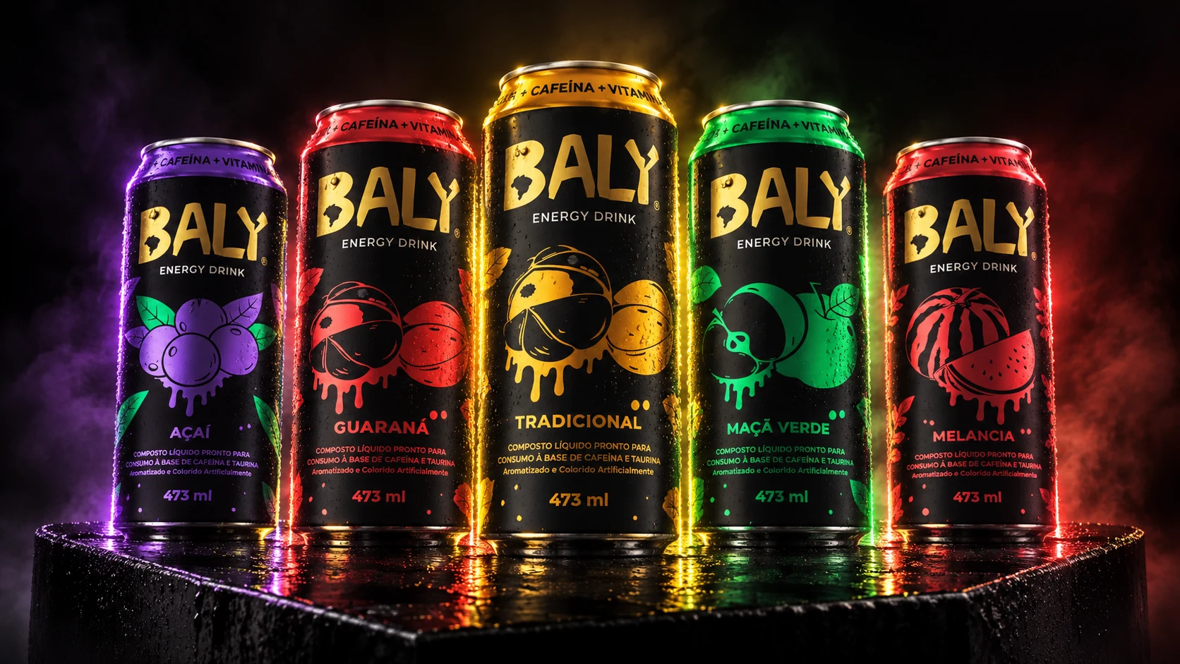
Five redesigned Baly Energy Drink cans arranged on a black reflective plinth
Portfolio visualization · Complete flavor family
01 · Overview

Energy, organized into a system.

Modernize the brand for a younger audience without erasing the recognition it had already built.

The academic brief called for a full visual repositioning of Baly Energy Drink. The answer was not a single label, but a flexible family: one unmistakable black-and-gold brand core supported by expressive illustrations and a clear color code for every flavor.

The system was developed across the redesigned logo, five 473 ml cans and a set of campaign-ready visual assets.

Context
Academic repositioning project
Institution
Anhembi Morumbi University
Role
Rebranding, logo and packaging application
Deliverables
Identity · Five cans · Visual assets
02 · Identity

Keep the name. Sharpen the signal.

01

Recognition

The Baly name remains the hero while a compact Brazil silhouette retains a familiar geographic cue.

02

Impact

Heavy handmade letterforms and a fractured “Y” turn the wordmark into an energetic focal point.

03

Motion

Lightning bolts extend the identity beyond the logo and create rhythm across packaging and campaigns.


Brazil silhouette symbol used in the Baly identity
Recognition cue · Brazil silhouette
Redesigned yellow Baly wordmark on black
Final wordmark · Impact and movement
03 · Packaging system

One family. Five distinct flavors.

The black can creates a consistent silhouette. Gold owns the brand. A flavor color, fruit character and matching details do the navigation.
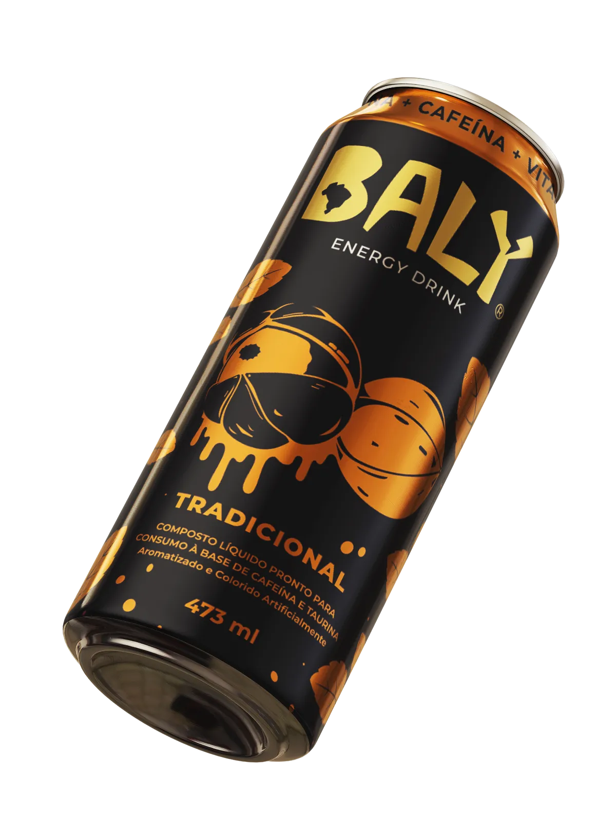
TradicionalElectric gold
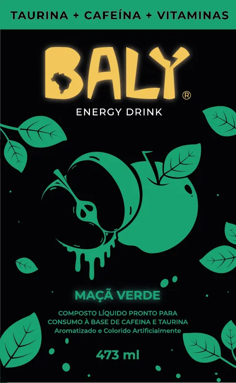
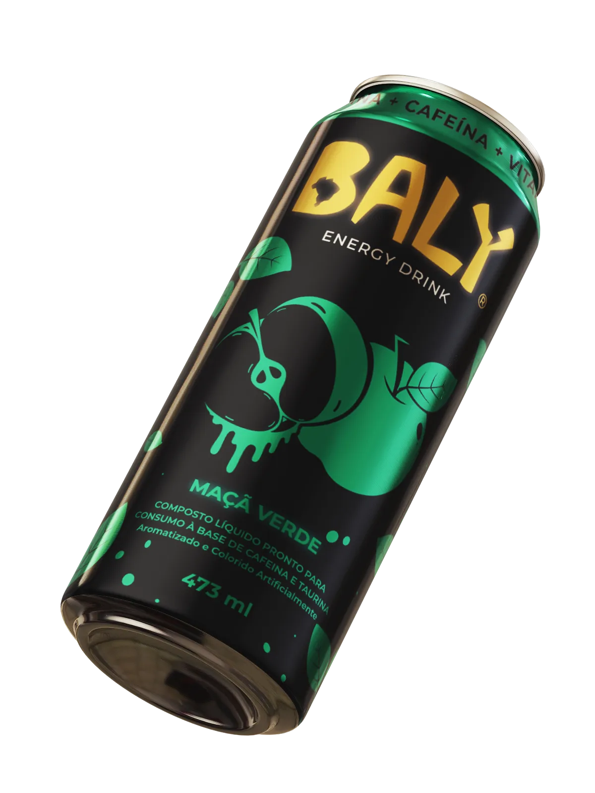
Maçã verdeAcid green
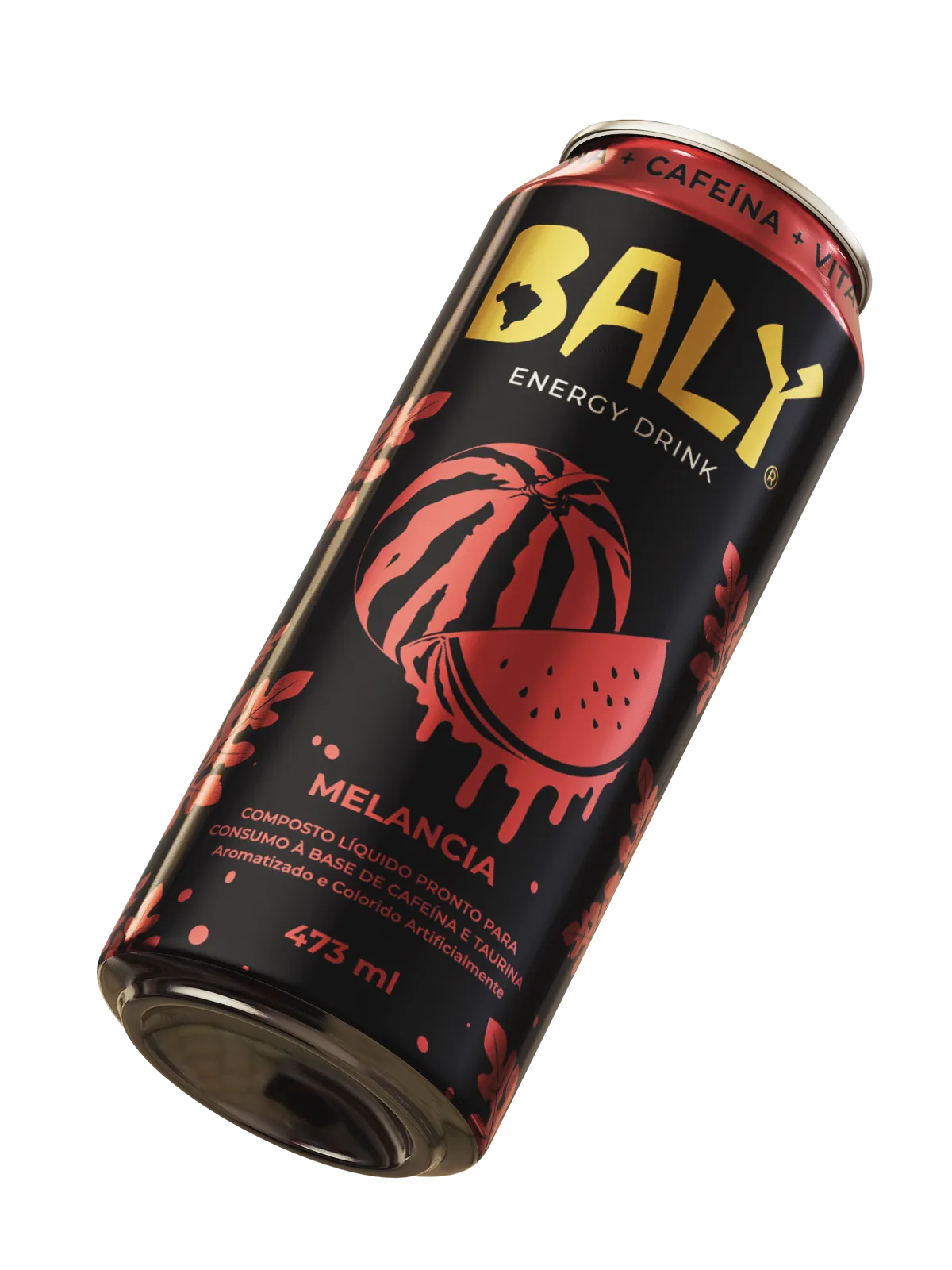
MelanciaSignal red
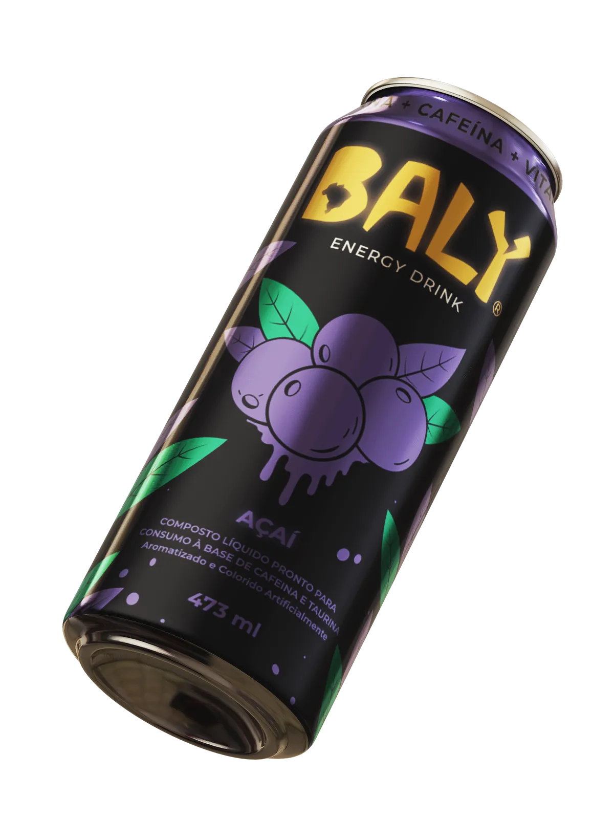
AçaíVivid violet
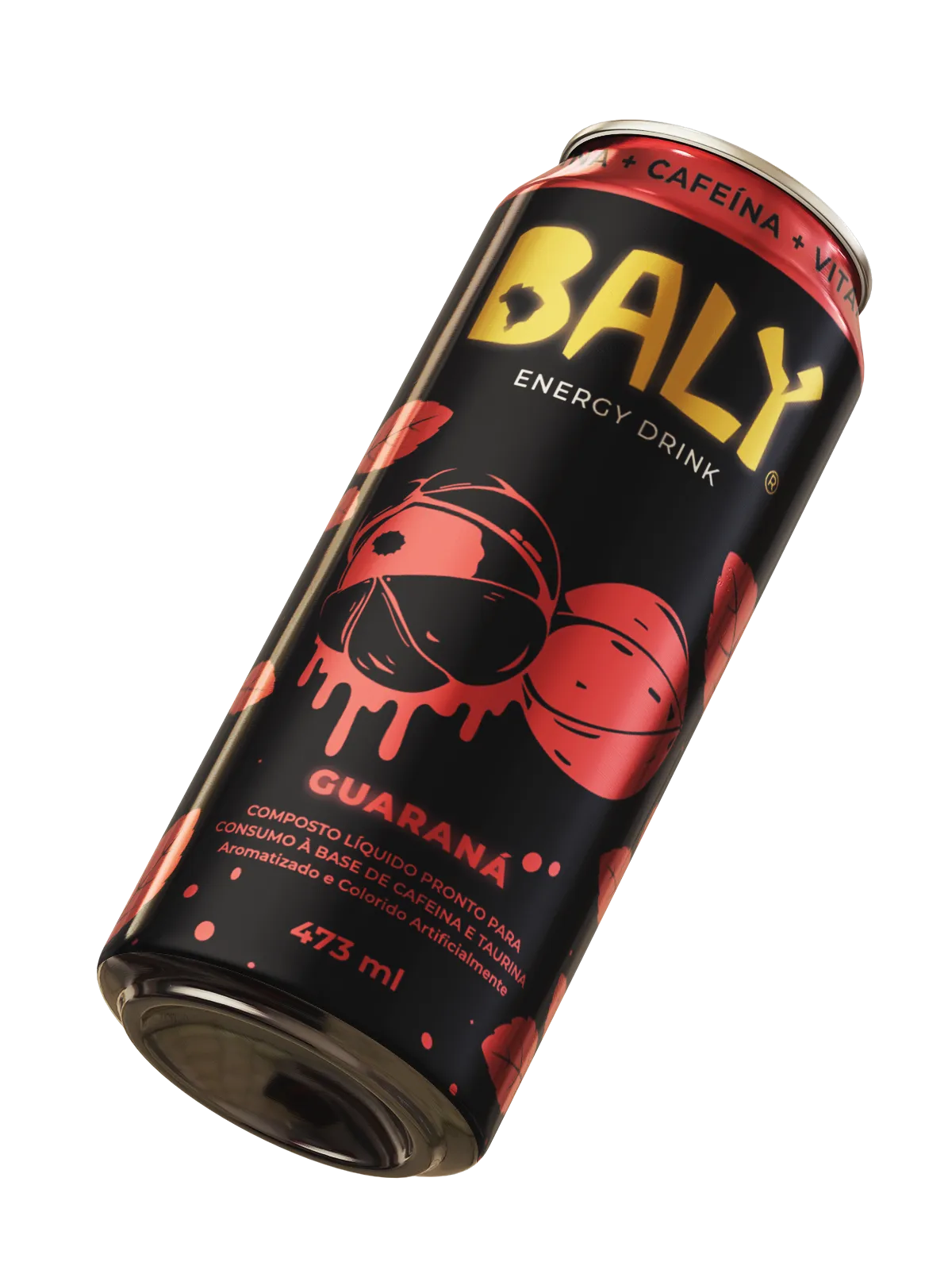
GuaranáWarm red
Baly Tradicional can
Tradicional
Baly Maçã Verde can
Maçã Verde
Baly Melancia can
Melancia
Baly Açaí can
Açaí
Baly Guaraná can
Guaraná
04 · Visual language

Flavor becomes character.

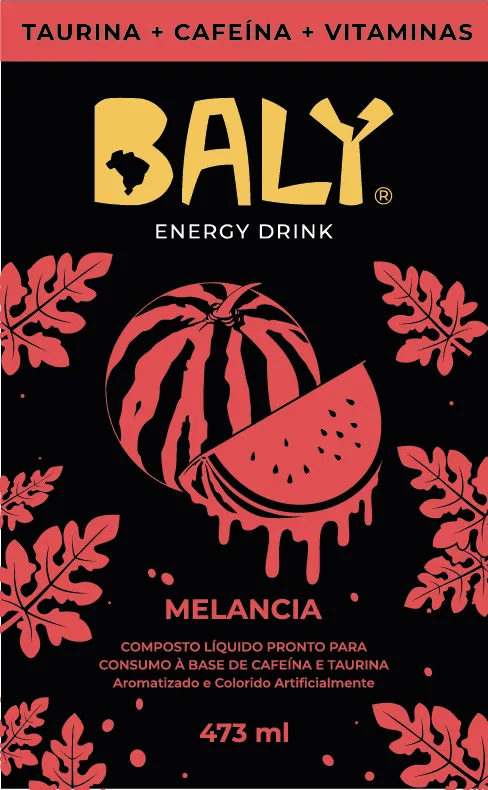
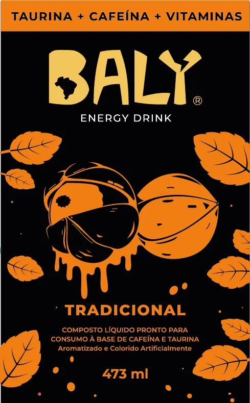
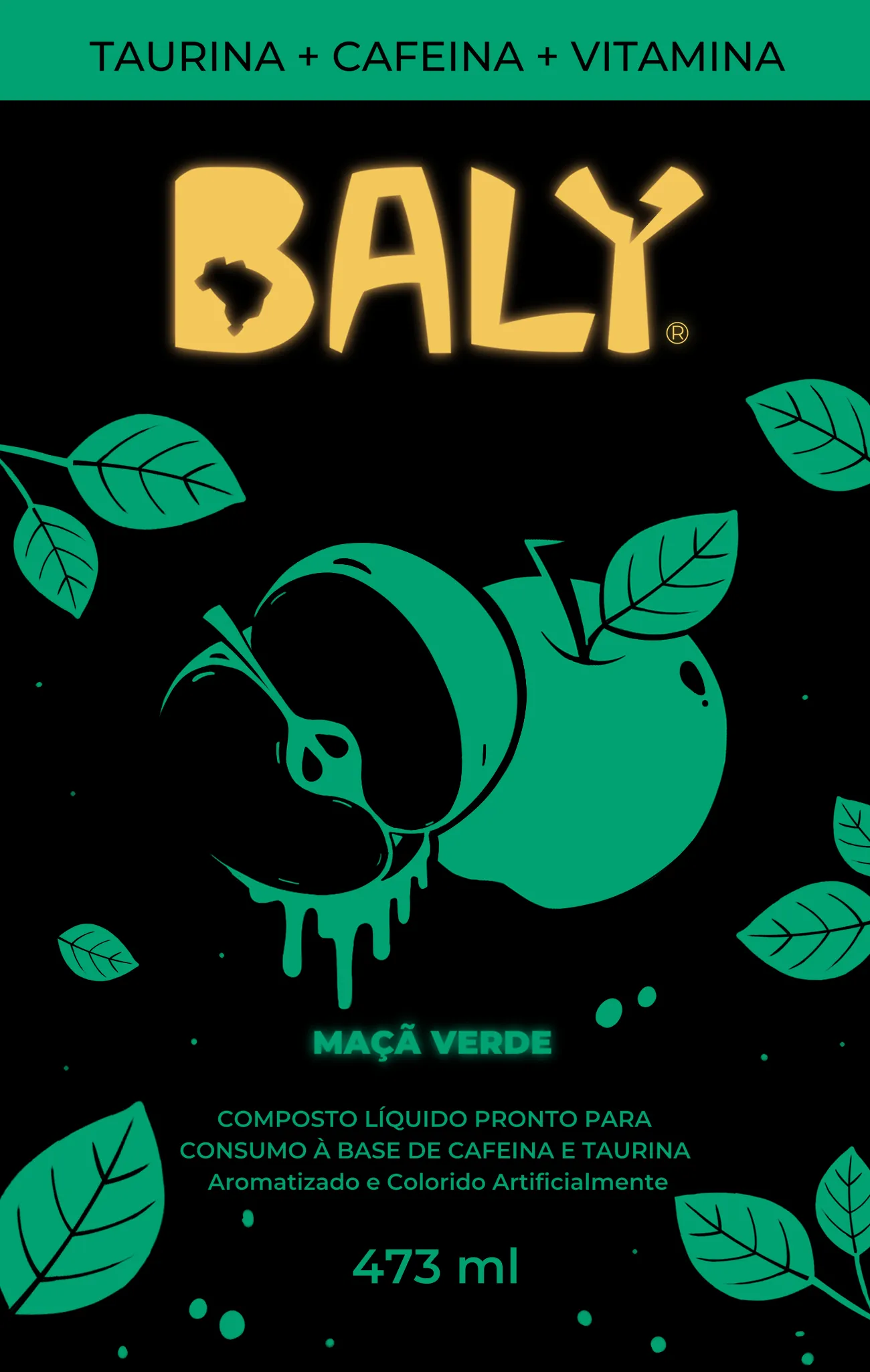
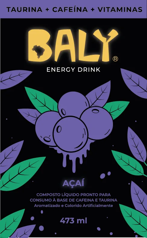
Each fruit is reduced to a compact, high-contrast illustration with leaves, droplets and outlines. Repetition turns those components into patterns that can move from the can to campaign layouts.

Yellow lightning bolt elements
Açaí packaging artwork
Açaí · Violet and green
Green apple packaging artwork
Maçã Verde · Acid green
Watermelon packaging artwork
Melancia · Signal red
Traditional flavor packaging artwork
Tradicional · Electric gold
Green apple campaign artwork
Campaign extension · Maçã Verde
05 · Applications

Built to live beyond the flat label.

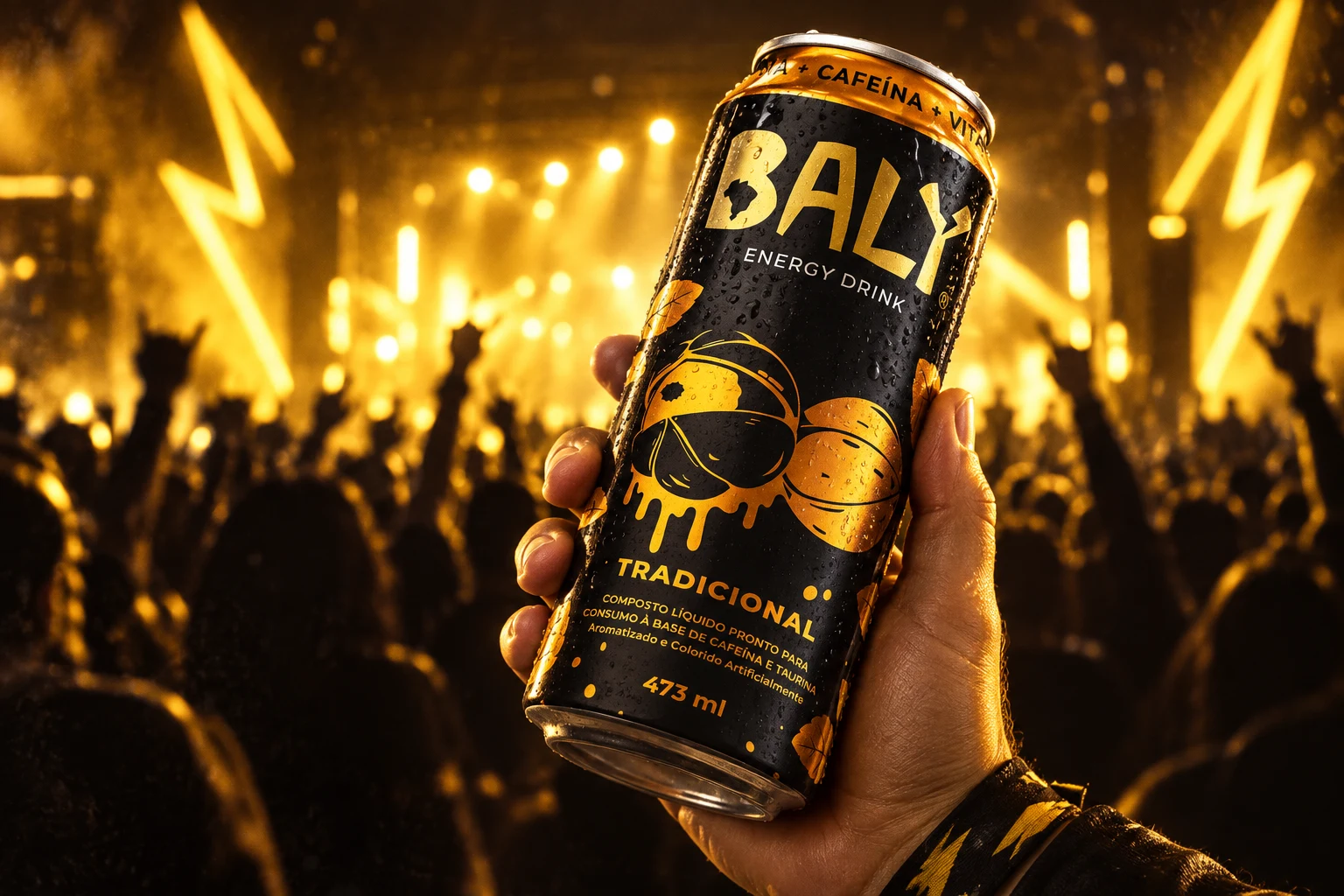
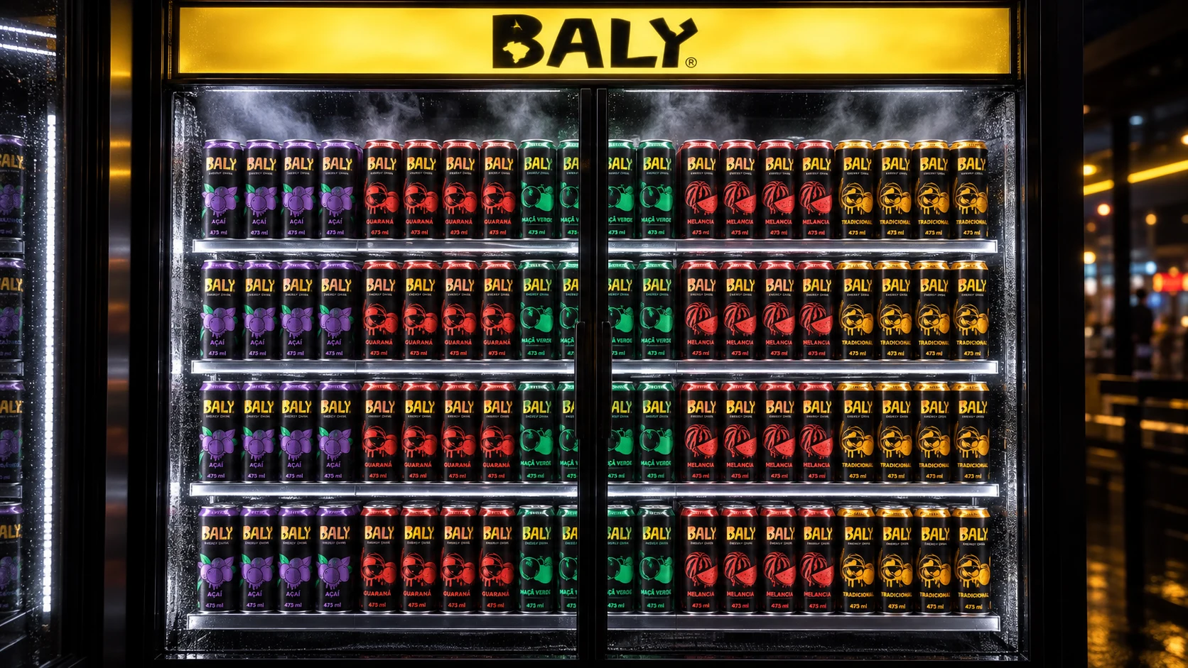
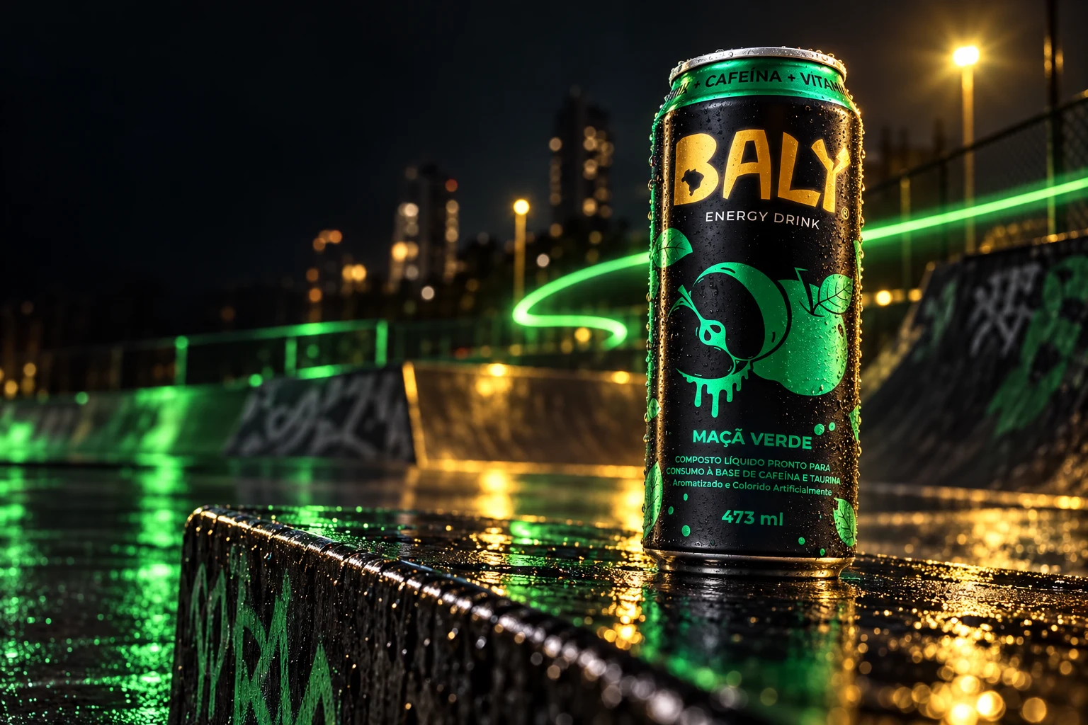
New portfolio mockups test the identity at three scales: a close product moment, a lifestyle environment and the repeated rhythm of a retail display.
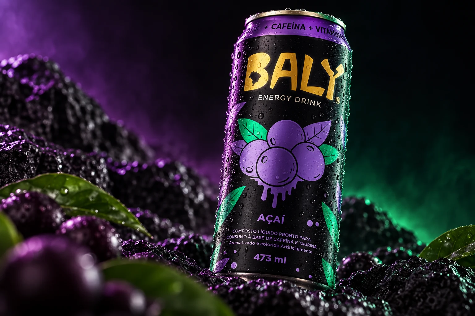
Baly Açaí can in a purple and green studio scene
Açaí · Studio product visualization
Baly Maçã Verde can at a wet skatepark at night
Maçã Verde · Lifestyle visualization
Baly Tradicional can held in front of a night event
Tradicional · Experiential visualization
Baly flavor range displayed inside a retail refrigerator
Complete range · Retail activation visualization
06 · Reflection

A packaging family that reads as one brand before it reads as five flavors.

The strongest result is the system itself: every can can change color and illustration without losing the shared Baly silhouette. The project demonstrates how a rebrand can preserve familiarity while creating more space for attitude, navigation and campaign expression.

What the project demonstrates

  • Brand repositioning without abandoning recognition
  • Modular packaging architecture across five SKUs
  • Illustration used as both information and personality
  • A visual language ready for retail and lifestyle applications
Next projectDoaleite