Critical design
Graphic design becomes a tool for discussing displacement, cultural erasure and xenophobia.
A 62-page graphic novel that uses an interplanetary journey to speak about immigration, xenophobia, language barriers and the search for belonging.
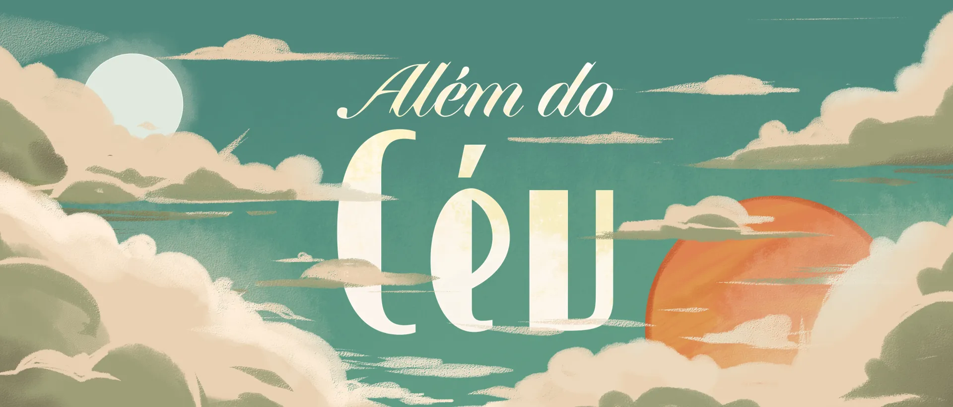 Original title: Além do Céu
Science fiction creates the distance needed to look at a present human crisis with empathy.
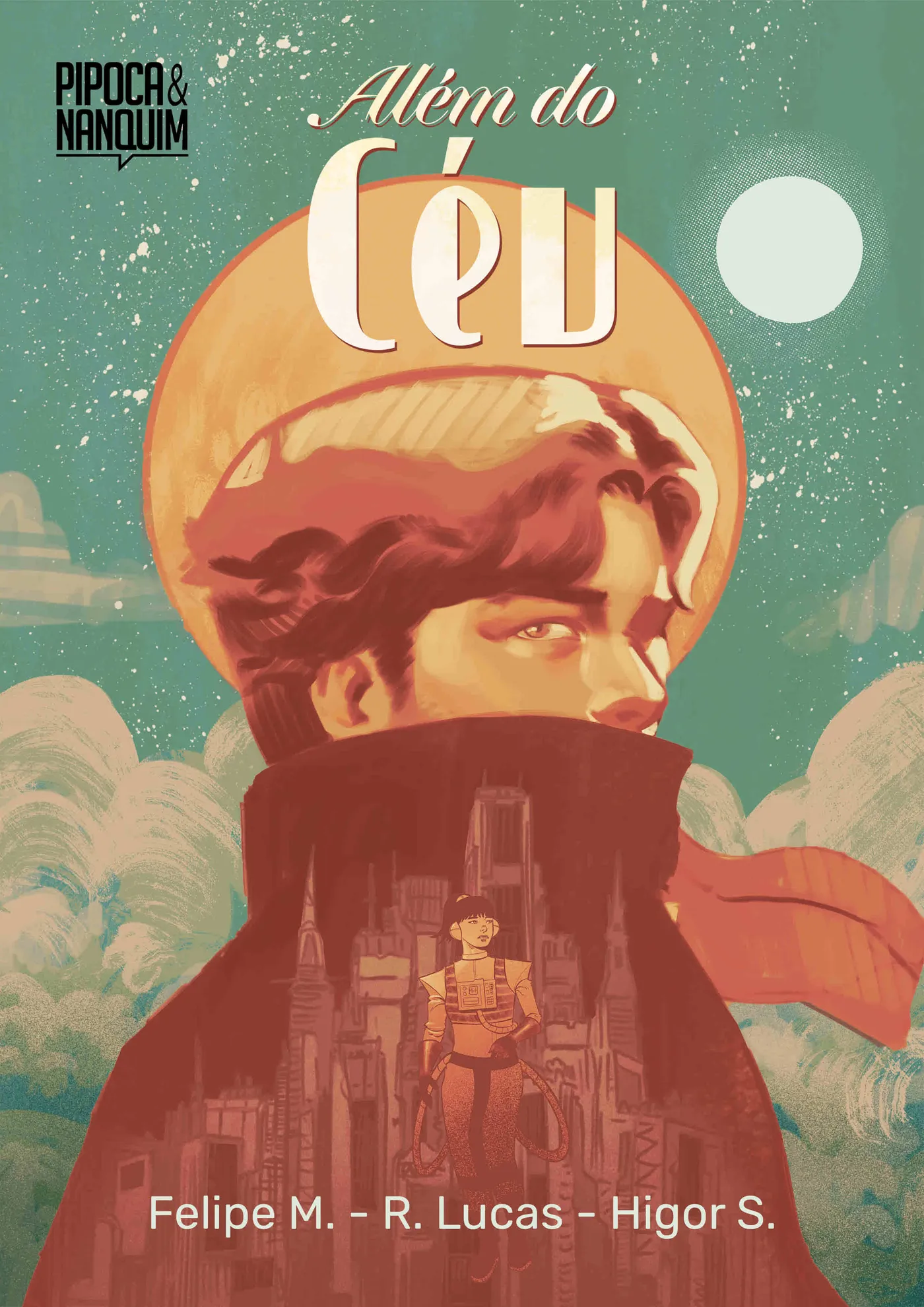
In a retrofuturistic society inspired by the 1940s, Scott meets Zayra, a child who arrived from another planet and cannot speak his language. Their attempt to reach the promised city of Saphira exposes surveillance, forced assimilation and the systems that decide who is allowed to belong.
The story translates immigrant displacement into an interplanetary metaphor. Instead of treating migration as a statistic, it places the reader inside the confusion, isolation and vulnerability of being unable to understand the world around you.
The narrative follows Kishōtenketsu, a four-part structure based on introduction, development, contrast and conclusion rather than a single conventional villain.
The project combines research, visual storytelling and editorial craft to build empathy without simplifying the subject.
Graphic design becomes a tool for discussing displacement, cultural erasure and xenophobia.
Composition, rhythm, color and silence guide the reader through fear, tension and connection.
A fictional planet makes a familiar social conflict visible from a new and more universal perspective.
Noir contrast, 1940s lettering, textured color and analog science-fiction references shape a world that feels both distant and historically familiar.
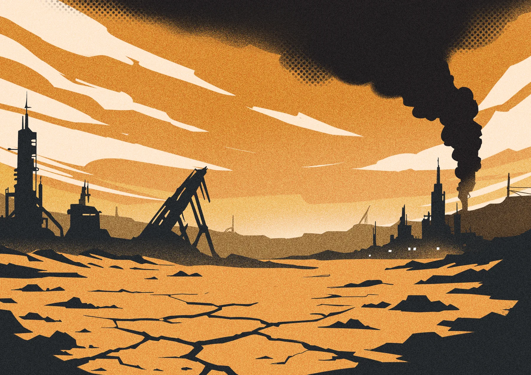
Noir shapes communicate pressure, surveillance and danger.
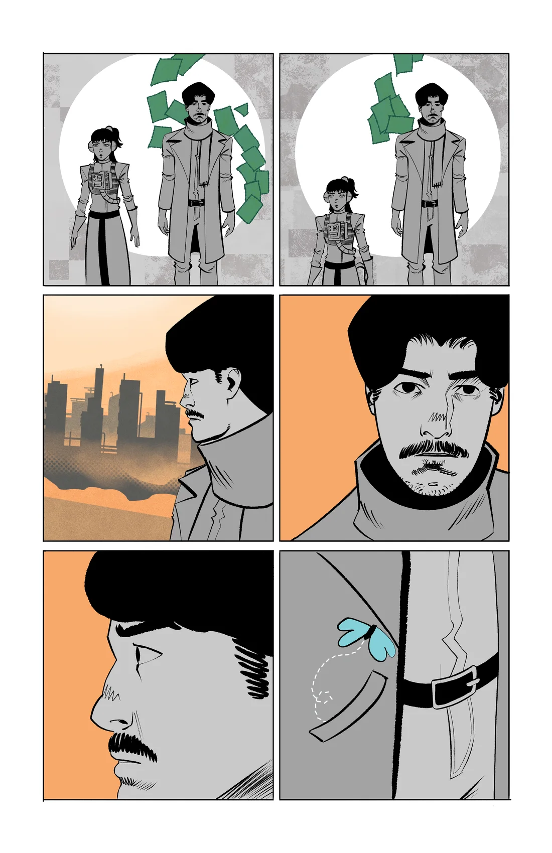
Warm orange marks the oppressive city and emotional tension.
Noise, halftone and worn surfaces reduce the feeling of digital perfection.
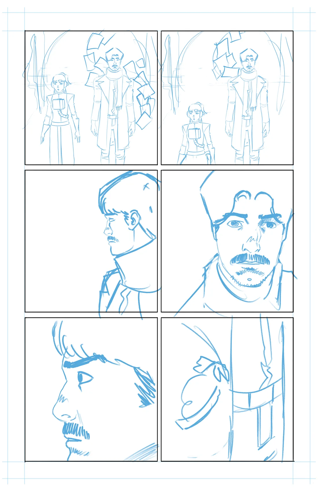
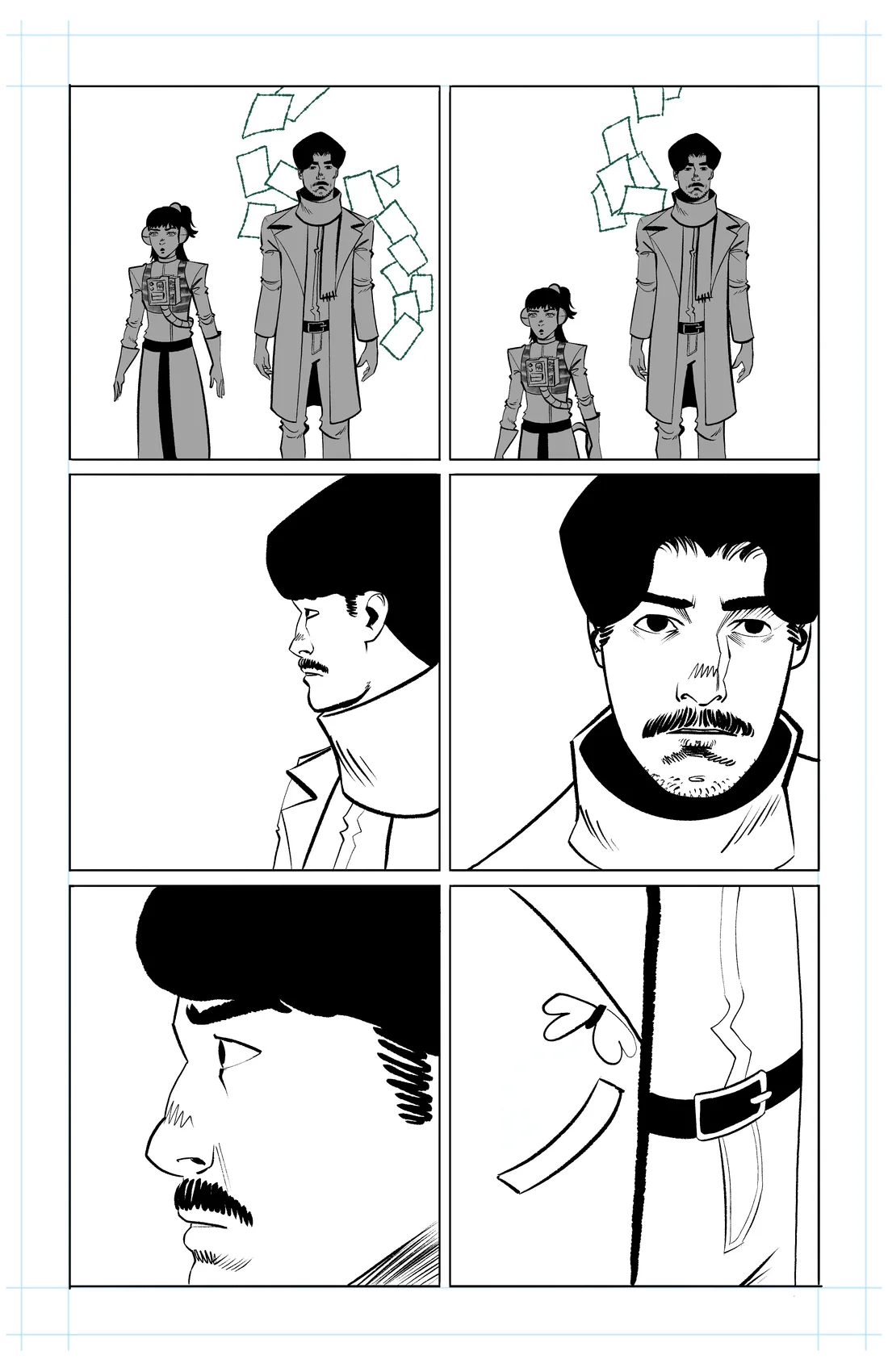
Selected scenes were first tested in 3D. Camera position, scale and gesture could be solved before the page moved into sketch, line art and final color.
Pose, scale and camera.
Panels, silence and pacing.
Gesture, expression and contrast.
Color, texture and depth.
The same exchange was explored from several angles before drawing. A wide view establishes the difference in scale between the characters, while closer tests isolate the adult's uncertainty and the object held between them.
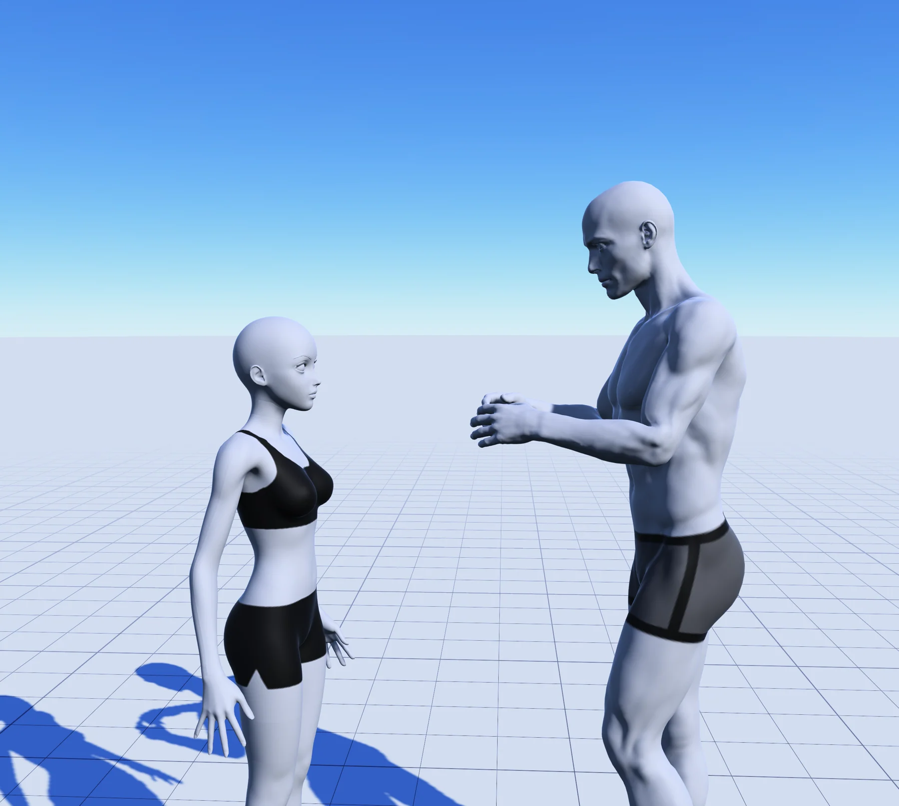
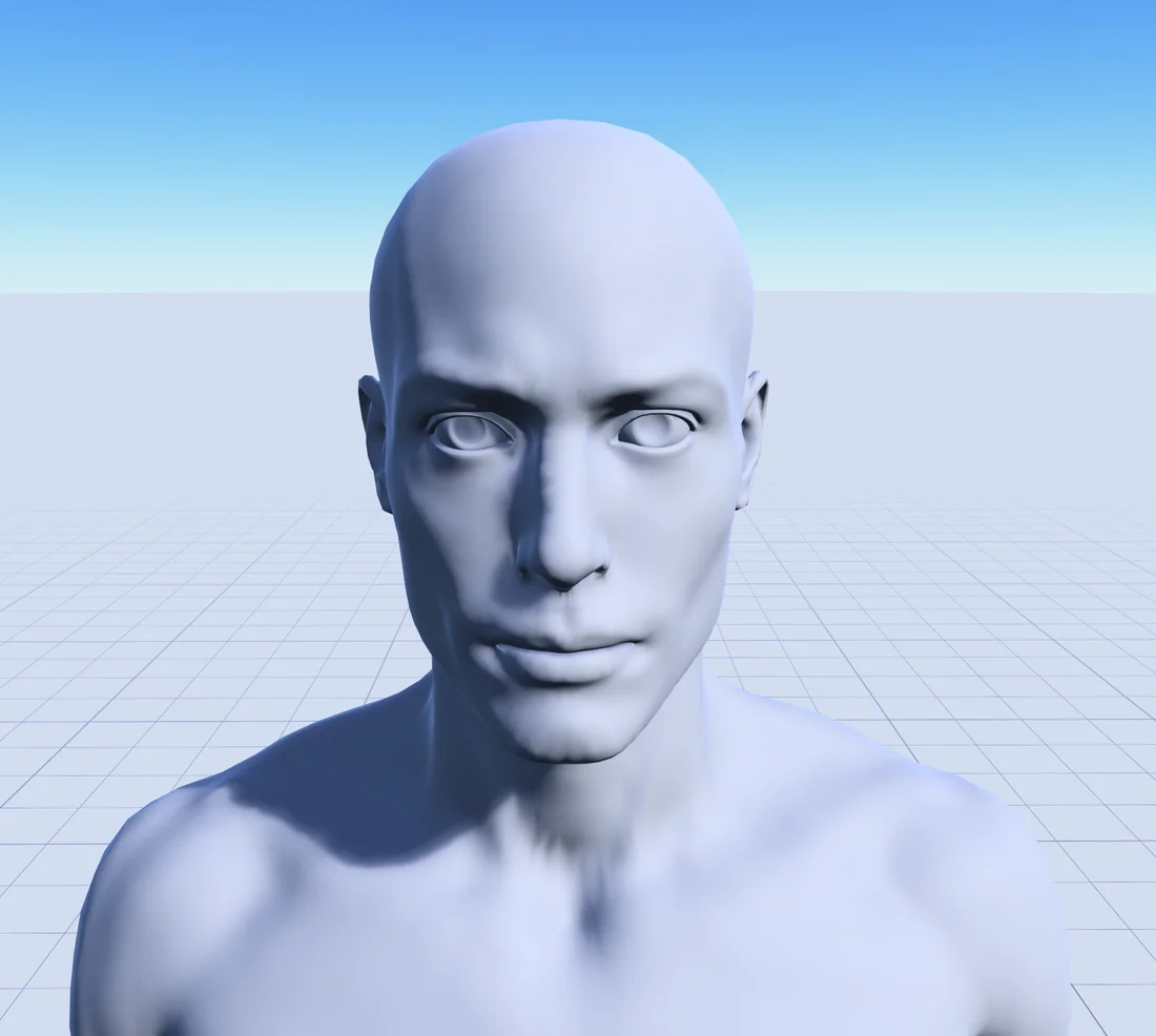
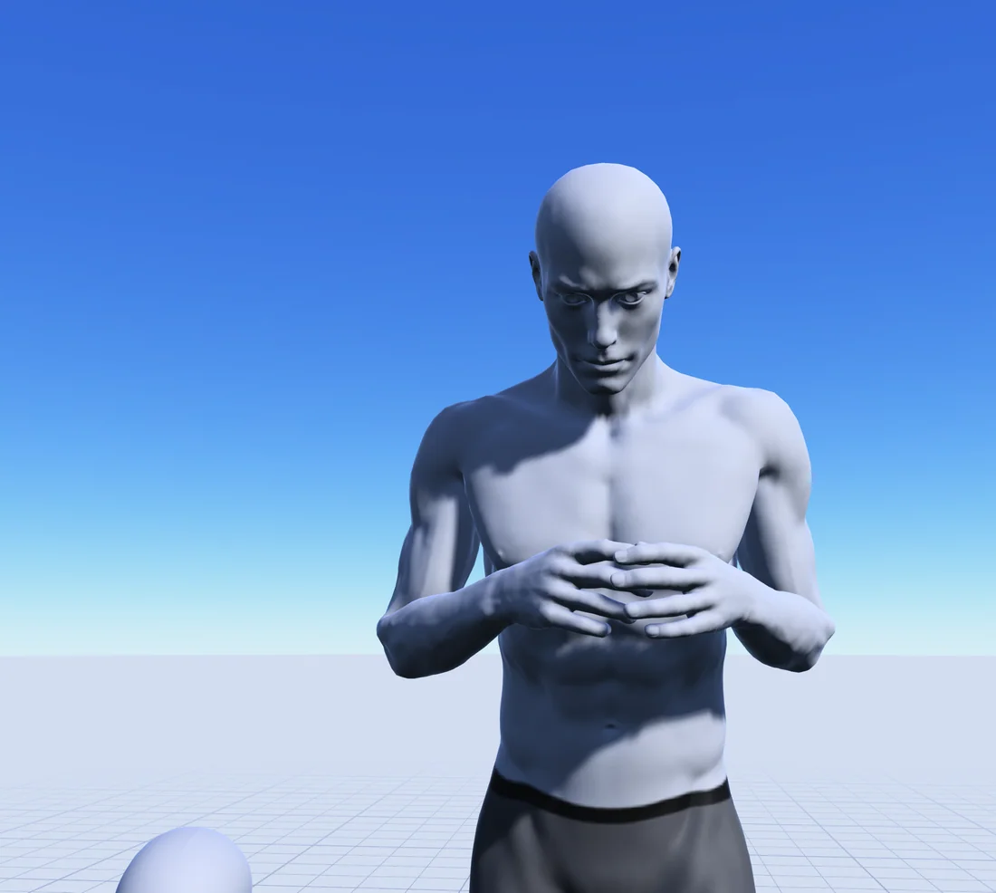
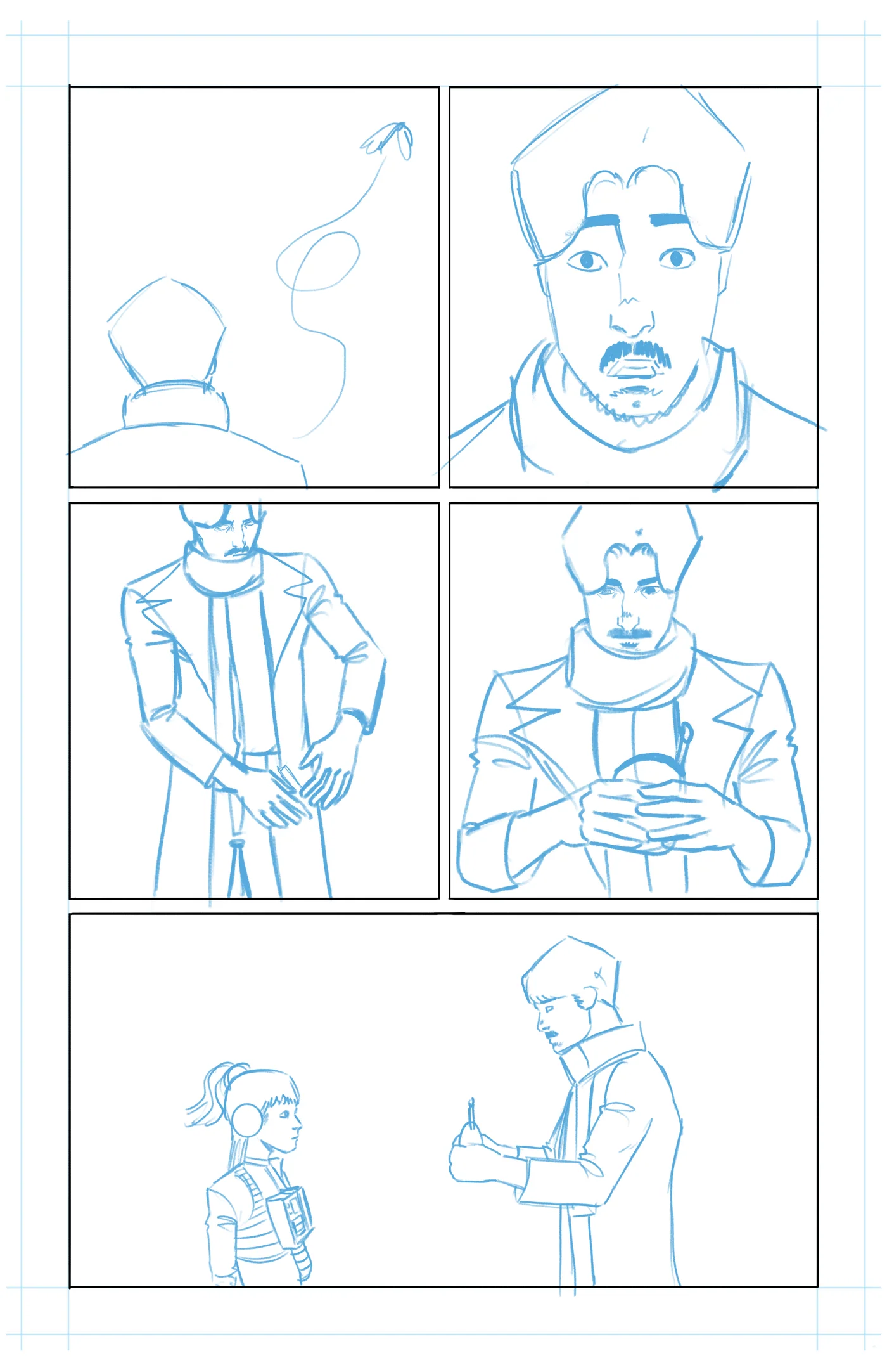
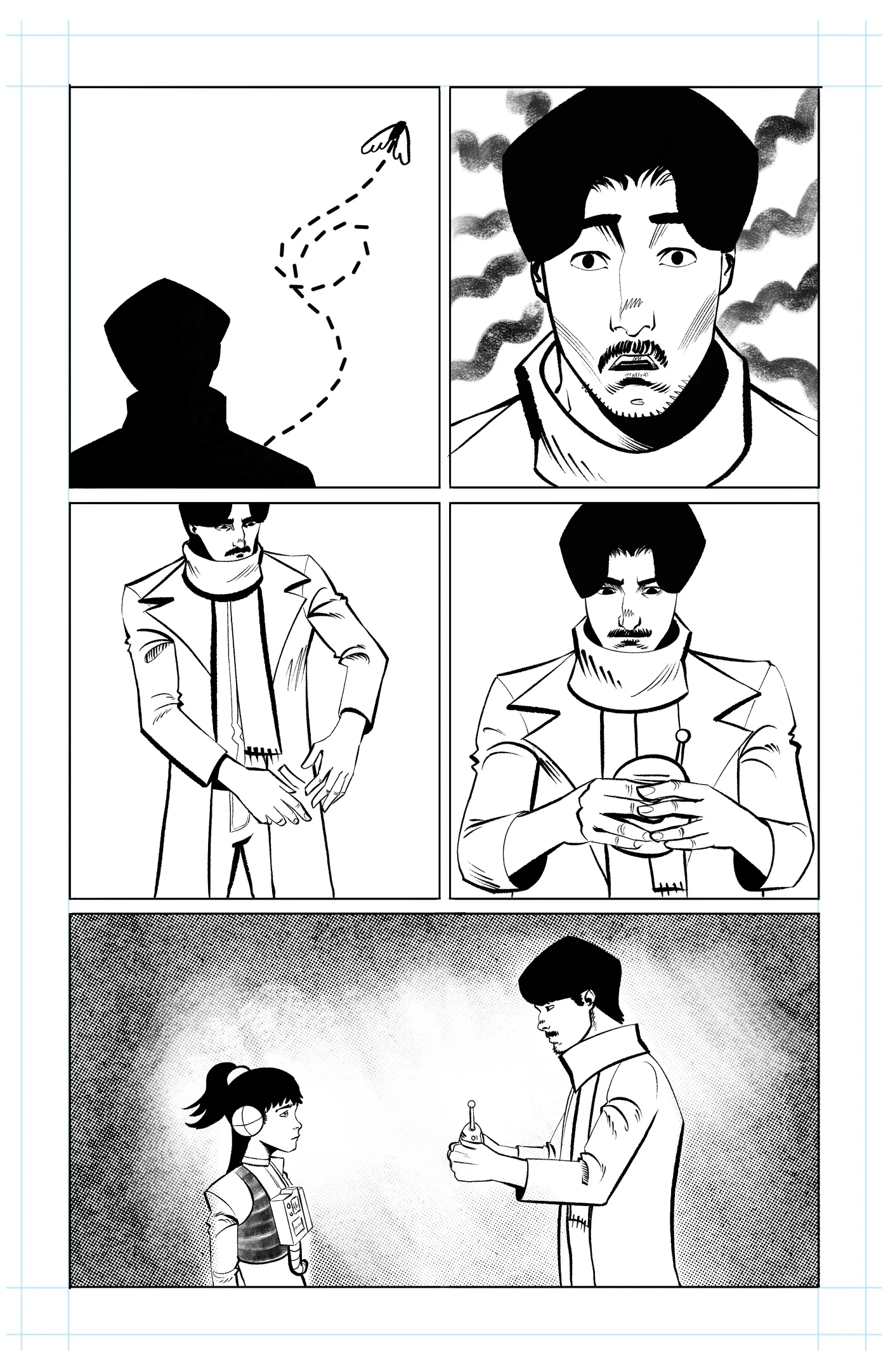
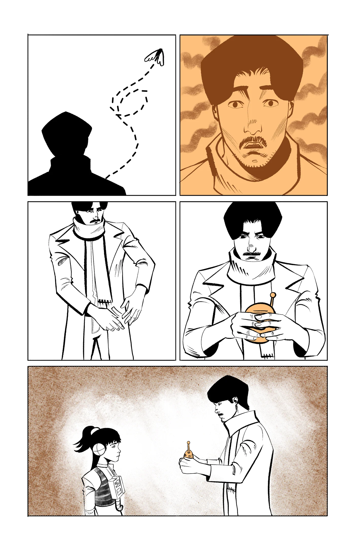
This page uses repetition, shifting scale and tighter crops to slow the moment down. The sequence shows how a loose structure becomes a controlled visual rhythm without losing the energy of the first drawing.
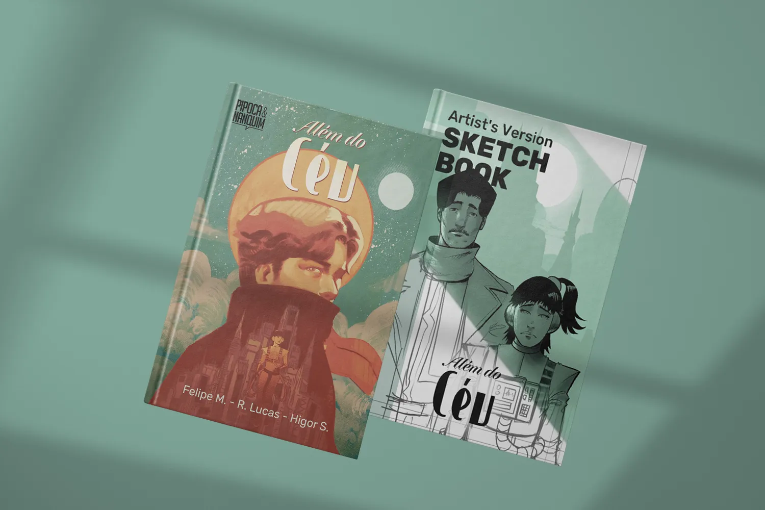
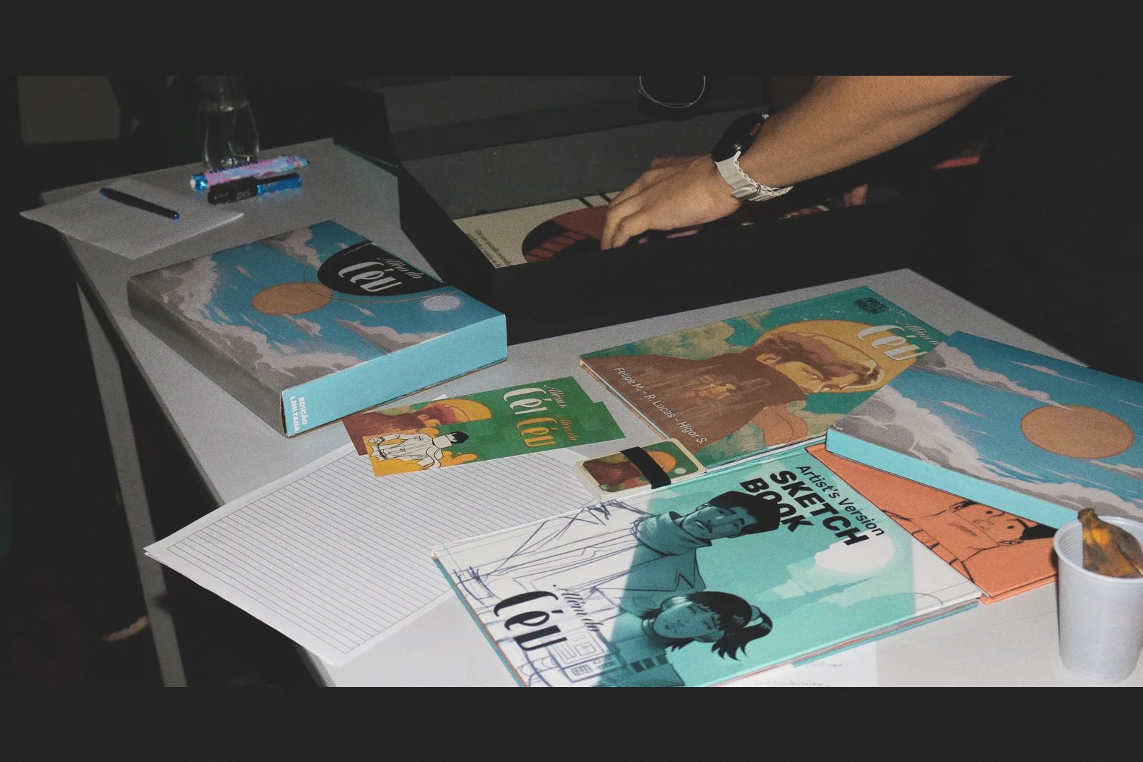
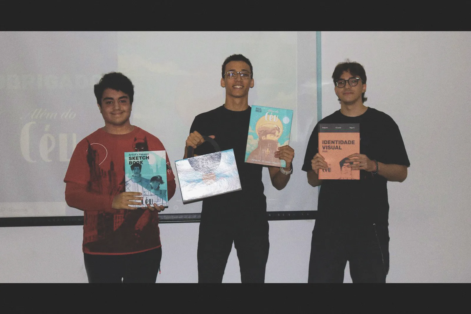
The 62-page book became a complete physical experience designed around journey, memory and collecting.
A complete 62-page sequential narrative.
A custom carrying box inspired by the visual language of travel.
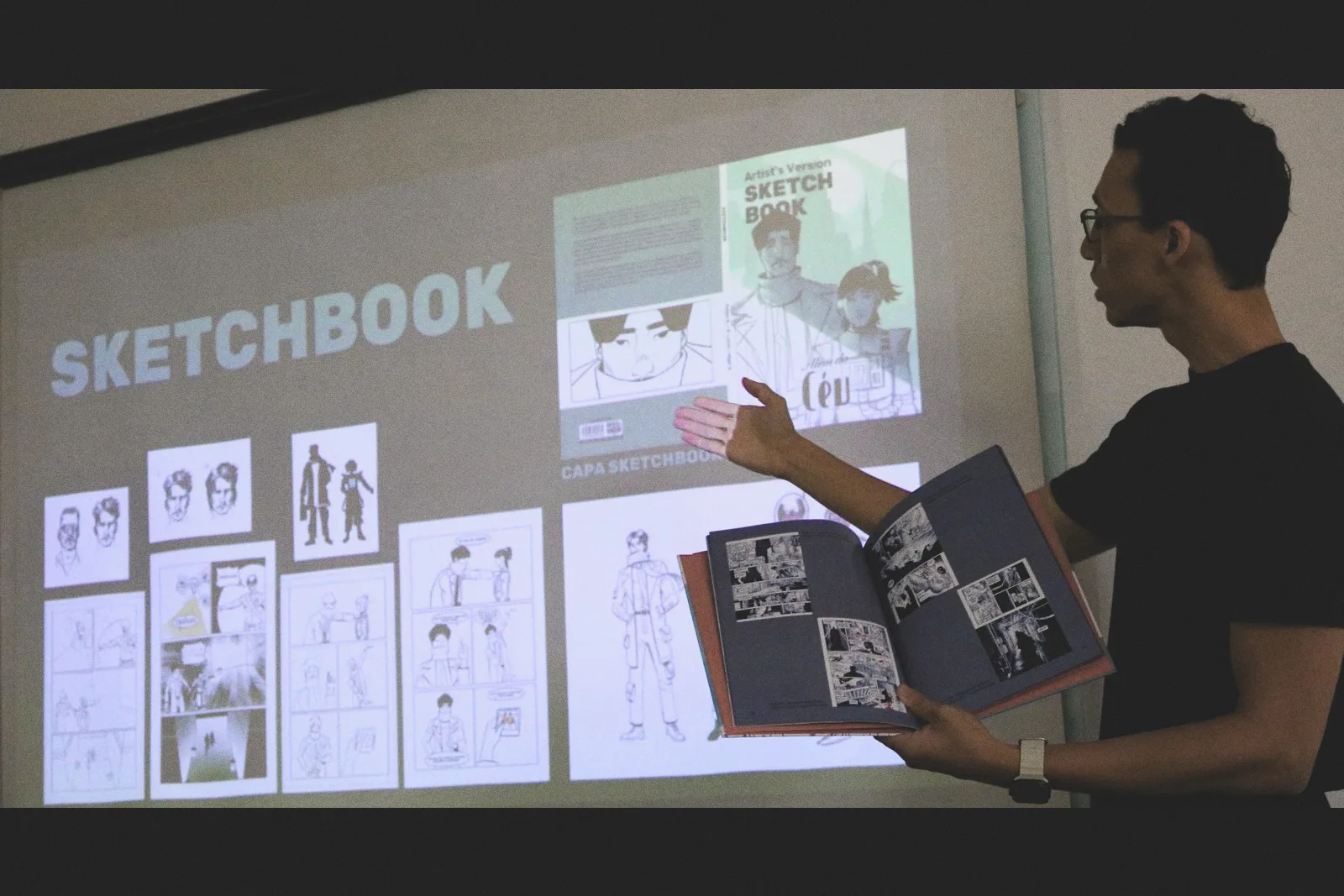
A sketchbook documenting thumbnails, character studies and page development.
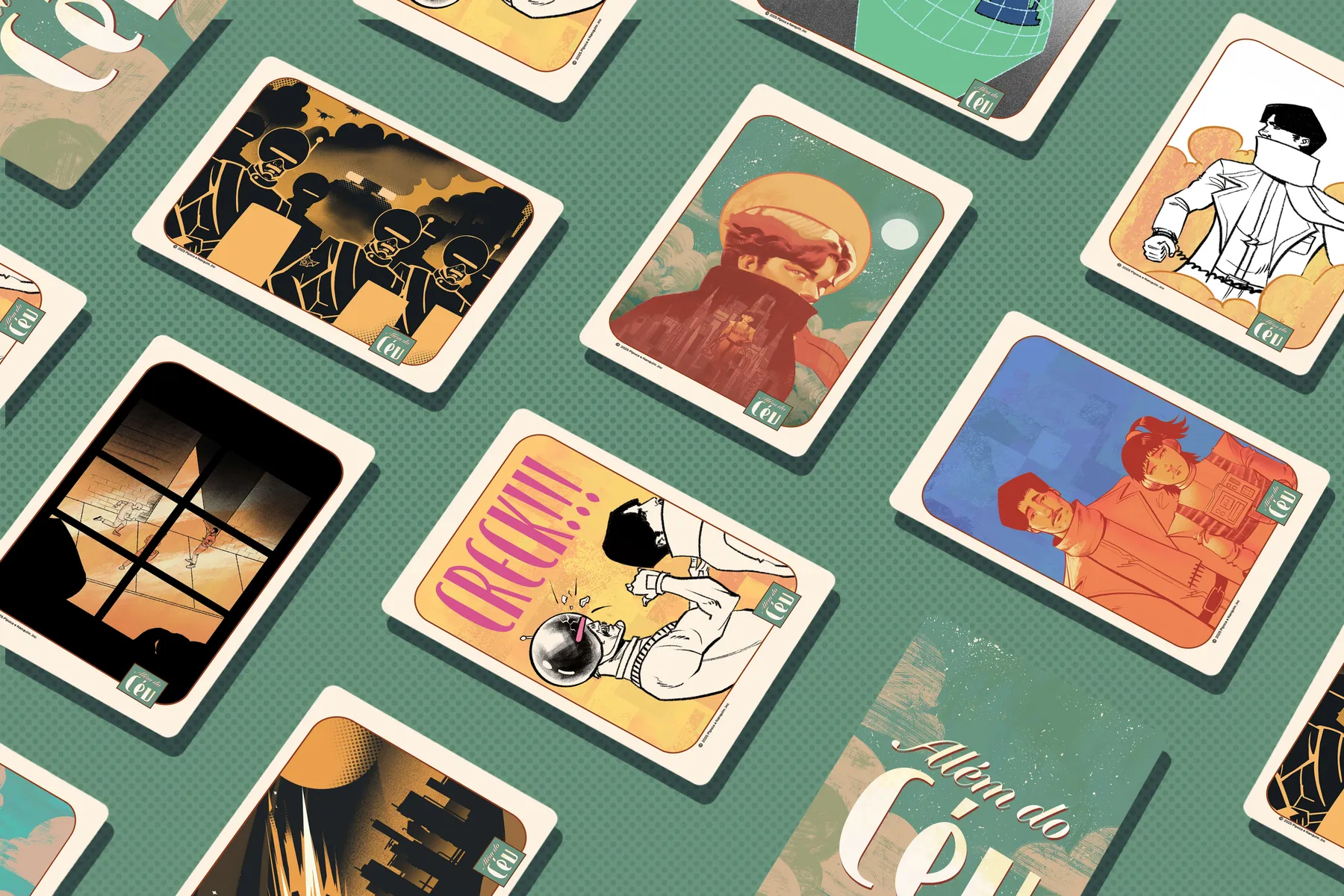
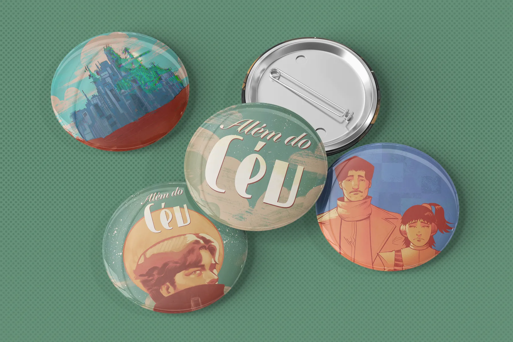
Cards, buttons, posters, print, bookmark and bookplate extend the story beyond the book.
-1400.webp)
-1400.webp)
A short selection from the 62-page publication. Use the arrows, keyboard or swipe to move through the opening pages.
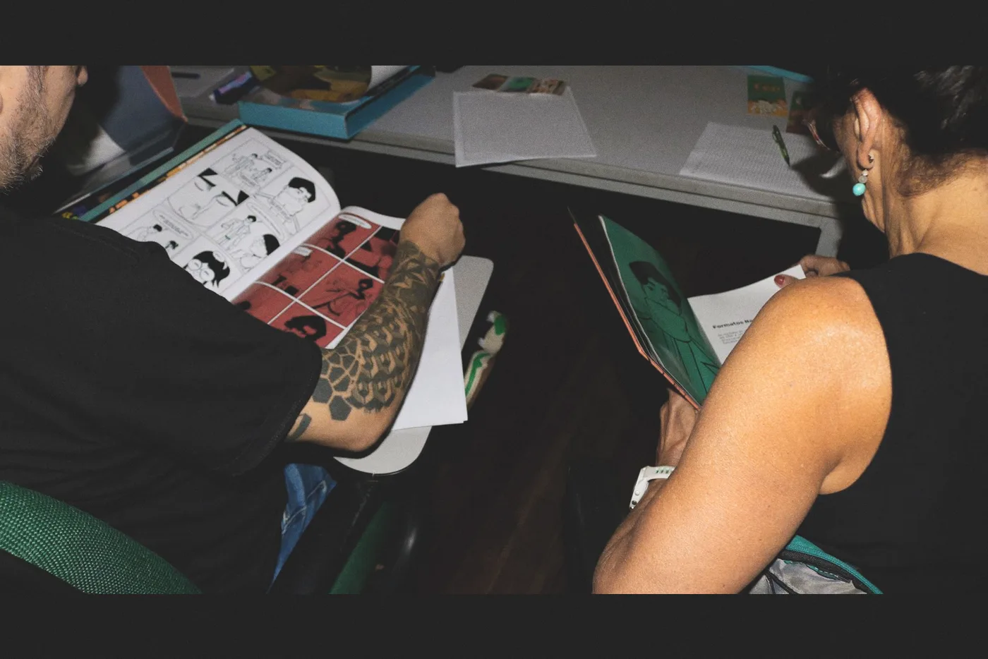
The final project was presented as a complete research, narrative and editorial system before the graduation evaluation panel.
Recognition
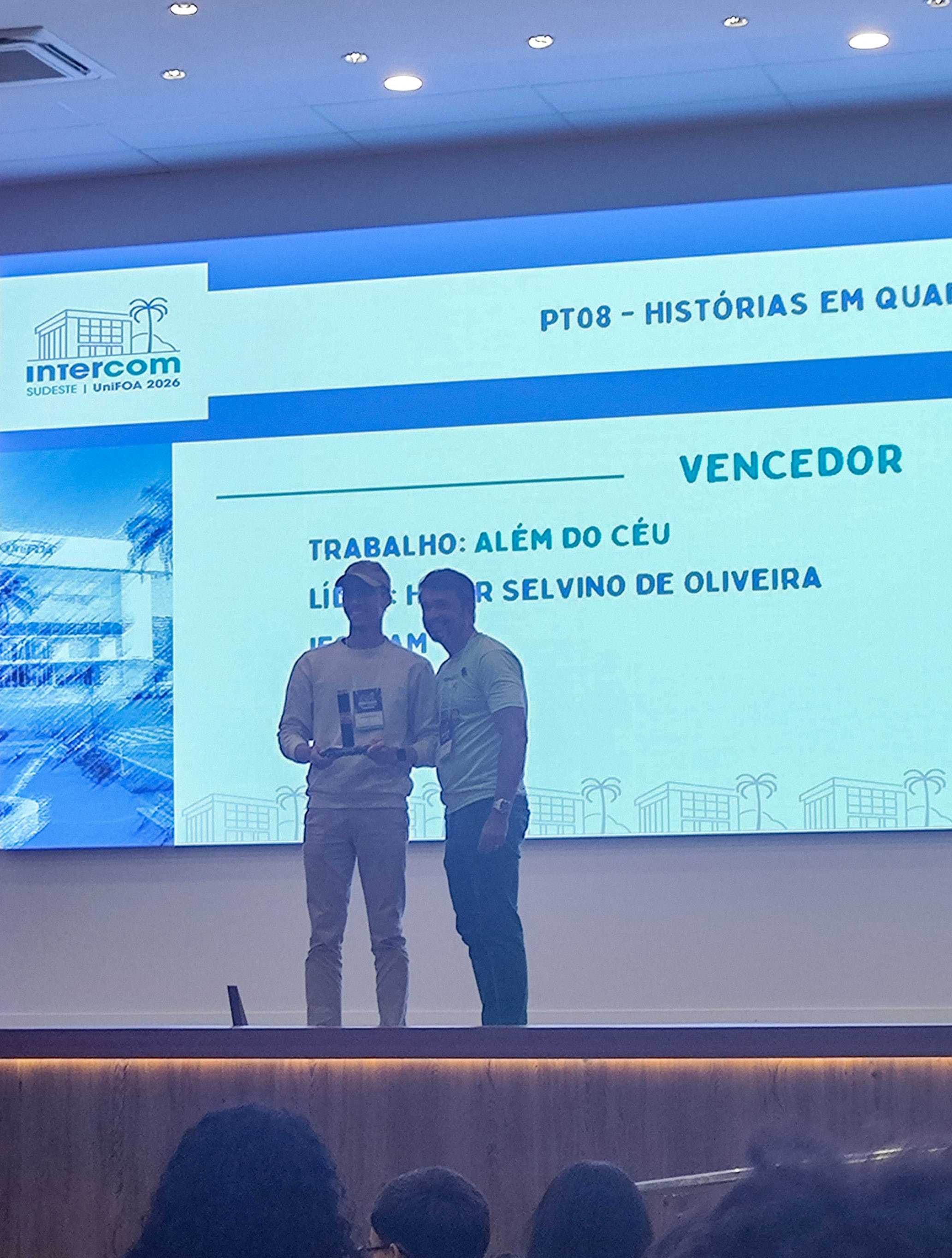
The project received first place in the comic-book category, recognizing its social theme, narrative research and editorial execution.
The one-minute teaser works as a fictional news broadcast that introduces the crisis before the reader opens the book.