Product Design / UX/UI / Visual Identity / 2026

Yen & HomeJapan Cost Planner

What does your life cost in Japan?

A grocery cart becomes a monthly plan.

A responsive planning tool for comparing grocery prices, shaping a realistic shopping routine and understanding recurring costs before moving to Japan.
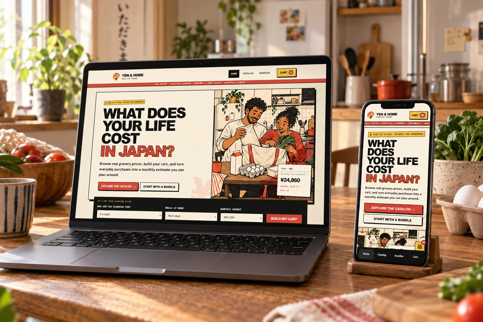
Yen and Home responsive website displayed on a laptop and smartphone in a warm kitchen
Responsive planning experience across desktop and mobile
00 / Overview

Plan the routine, not only the purchase.

Yen & Home turns individual prices into a more useful question: what will this way of living cost each month?

The concept connects product comparison with personal context. Household size, meals at home, budget, quantities and shopping frequency all influence the estimate.

The interface uses a bold print-inspired identity to make dense information approachable while keeping every decision visible.

Year
2026
Role
Product strategy, UX/UI, visual identity and front-end prototype
Deliverables
Responsive experience, catalog, bundles, cart and design system
Status
Self-initiated interactive prototype
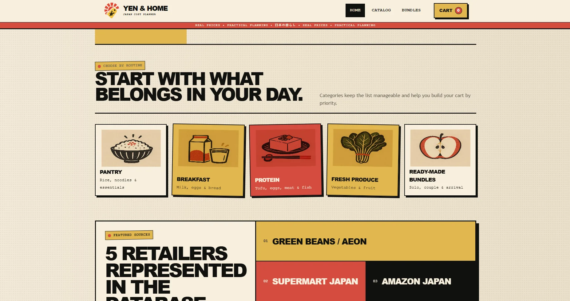
Yen and Home homepage showing shopping categories and represented retailers
Categories organize the catalog around real routines instead of an overwhelming product list.
01 / Problem

A price alone cannot explain a life.

People planning a move can find isolated grocery prices, but translating packages, quantities and repeated purchases into a reliable monthly picture requires too much manual work.

Prototype noteCatalog values and currency references demonstrate the model and interaction flow. They are illustrative and should not be read as live financial guidance.
01

Comparable

Package size, total price and unit price appear together so similar items can be evaluated quickly.

02

Personal

Household size, budget and meal routine create a useful starting point without blocking exploration.

03

Monthly

Quantity and purchase frequency turn a one-time cart into an estimate that supports planning.

02 / Product flow

Five steps from uncertainty to a usable estimate.

  1. 01Set household and budget
  2. 02Browse categories or bundles
  3. 03Compare package and unit price
  4. 04Adjust quantity and frequency
  5. 05Review the monthly estimate
Printed-style illustration of a couple unpacking groceries in a Japanese home
Design direction

A practical tool with the warmth of a printed household guide.

The illustration gives the abstract topic of cost planning a human context. Paper textures, offset color and direct typography make the product feel accessible without hiding the functional structure underneath.

03 / Catalog

Dense information, kept easy to compare.

Filtering and sorting stay close to the products, while the quick-comparison panel preserves budget context throughout the catalog.
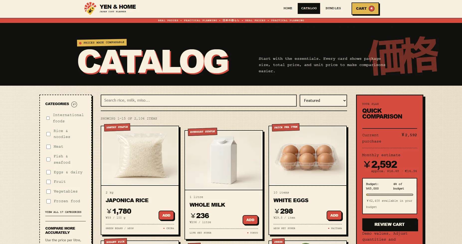
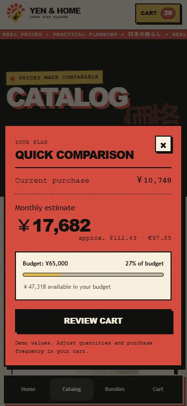
Yen and Home catalog with category filters, product cards and a quick comparison summary
Desktop catalog with filters, product metadata and persistent plan summary
2,106Items represented in the catalog model
17Shopping categories
5Retailer sources represented
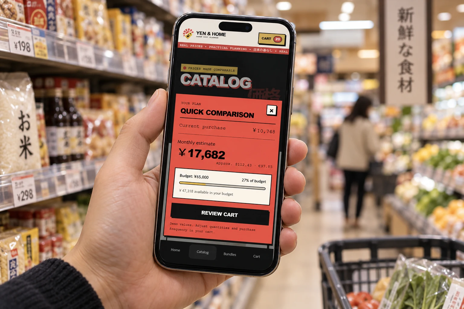
Mobile quick comparison sheet showing current purchase, monthly estimate and budget usage
Mobile quick comparison keeps the calculation one tap away.
Yen and Home quick comparison interface being used on a smartphone in a Japanese supermarket
In context: the monthly estimate remains available while comparing products in store.
04 / Starting points

Bundles reduce blank-page decisions.

Solo, couple and routine-based bundles act as editable foundations. They never lock the user into a fixed package.
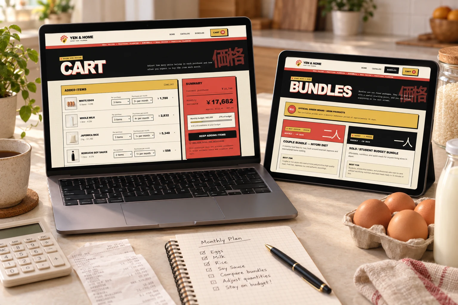
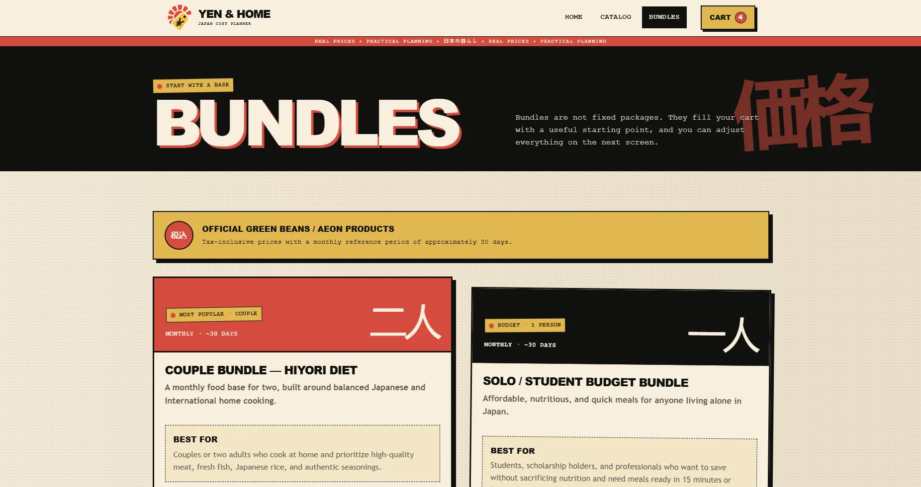
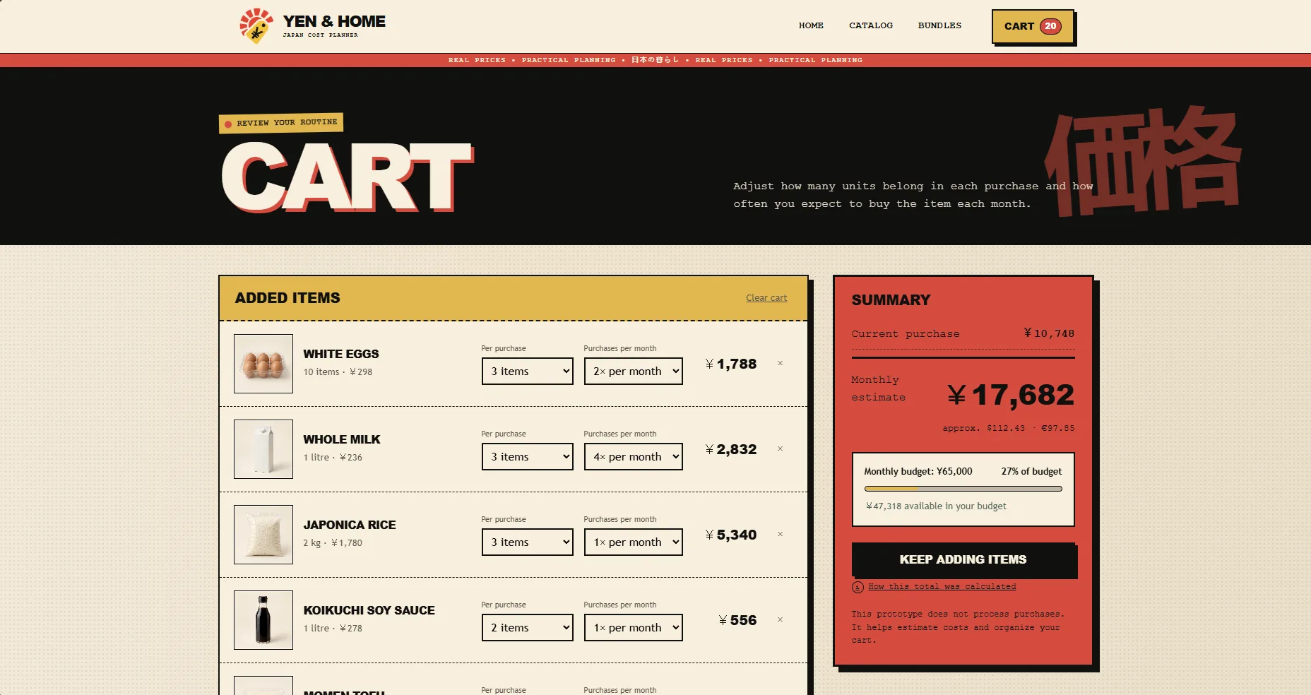
Yen and Home cart and bundle screens displayed on a laptop and tablet beside household planning materials
Cart and bundle tools work together as one transparent monthly planning flow.

Swipe or scroll to see both screens

05 / Visual system

Utility, print texture and Japanese references.

The identity combines the decisiveness of price labels with the familiarity of grocery illustration. Repetition and rough edges make the interface memorable while strict spacing keeps it usable.

Ink#11110FPaper#F4EAD5Market red#DB4C3EYen gold#E4B947
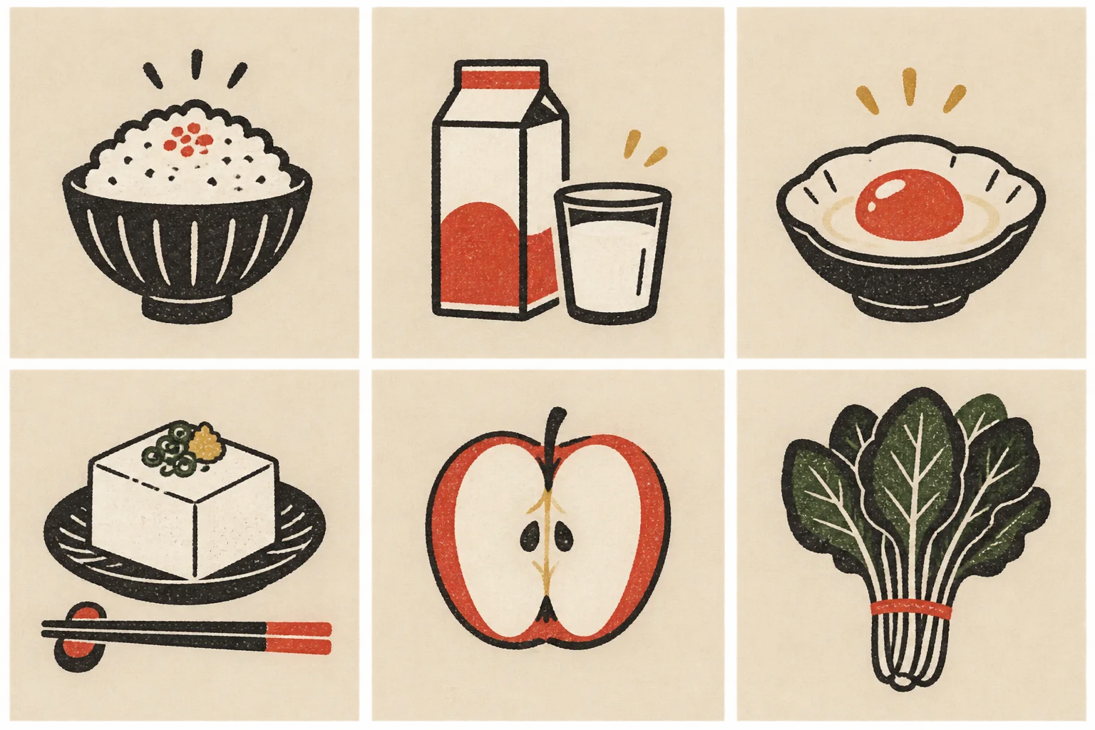
Illustrated food category icons for rice, breakfast, protein, tofu, fruit and vegetables
Category illustration language
Product image system showing noodles, cooking oil and yogurt against a warm neutral background
Consistent product photography treatment
06 / Outcome

Make the cost of a routine visible before it becomes a surprise.

The final prototype connects brand character and practical product logic across desktop and mobile. It demonstrates catalog navigation, editable starting points, transparent calculations and a responsive cart experience.

What this project demonstrates

  • Product strategy for a complex planning question
  • Information hierarchy for comparison-heavy interfaces
  • A responsive interaction model from catalog to cart
  • A distinctive visual identity applied as a functional system
Next projectRevision Room